V-Labs: MVP LMS for SOSE
A Journey of Discovery – Strap in, all will become clear…

Client: The School of Systems Engineering (SOSE)
Project: Team ‘Engineers’ Client project at General Assembly
Date: April - May 2022
Duration: 3 week sprint
Role: User Interviews, Data Synthesis, Ideation, Prototyping, Branding
Methodologies: Comparative Analysis, Screener Survey, User Interview, Affinity Mapping, Personas and Scenarios, Problem Statements, HMWs, User Flow, Ideation, Wireframing, Prototyping, Moderated User Testing
Tools: Zoom, Excel, Google Forms, Figma, Figjam, Paper Sketches
Team: Jess Angela, Michaela Leary, Simon Yoseph, Tom Rapacioli
The Brief
The School of Systems Engineering (SOSE) provides university students with industry projects for their final year thesis. In turn, producing better engineers. The goal of SOSE is to help move students out of the lecture halls of theory and into the hands of daily practitioners by educating and sharing the best methods for applying Systems Engineering on live projects.
In addition, it has been identified that there is a deficit of qualified Systems Engineers as evidenced by the following data:

The Challenge
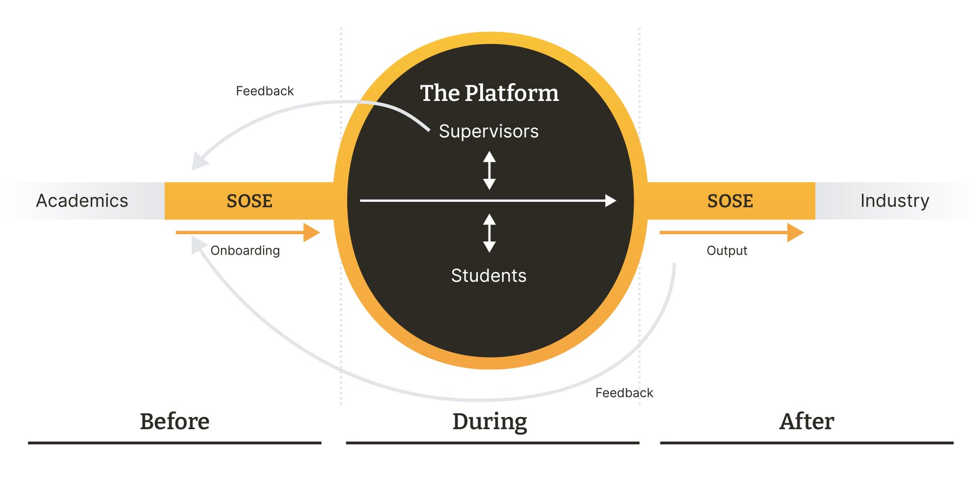
Our challenge was to design a web-based platform where students, supervisors, academia, and industry can collaborate on research projects. The flow diagram below is representative of a typical SOSE project.
The Solution
Our solution was based around a dashboard design for a Learning Management System (LMS) where project stakeholders can collaborate on tasks and easily navigate their way through the course of a Systems Engineering project and it’s various stages of work. Whilst providing a space to work, provide feedback and share supporting tools and information the platform placed emphasis on promoting healthy collaboration between students which was seen to be the biggest challenge to providing successful outcomes.
To give some industry context to the value of this sector and to highlight the potential for growth please see the data below:

Read on to find out more…
The Journey
Introduction
With the group selected by our course lead we gathered together and briefed on the Friday before or initial client meeting on the following Monday afternoon. It immediately became clear that the subject of the brief was something completely new to all of us. The first stop was therefore to gain a basic understating of Systems Engineering. Without this we wouldn’t have context for the client meeting and be able to ask the right questions.
“Systems Engineering is a transdisciplinary and integrative approach to enable the successful realization, use, and retirement of engineered systems, using systems principles and concepts, and scientific, technological, and management methods.”
Systems Engineering was first used by the RAF in WWII to plan and manage its defence systems. Effectively the study and practical application of multiple systems (systems within systems) other often cited examples are the NASA space programme in the '70s right up to contemporary examples such as fintech in banking.
At the heart of the discipline is the V Lifecycle methodology, which in UX terms could be compared to the Double Diamond. When the V Lifecycle methodology is applied to an engineering project it should provide a clear structure to follow and plan out the lifecycle of a product from cradle to grave.

Client Kick Off Meeting
So far we’d been provided with a three page brief, a 20 page project governance presentation, several example teaching tools and a research document provided for something called "Product Labs".
After introductions, the first part of the meeting we reserved for the client to speak and for us to listen. We had a lot to take in! Finally however things were starting to make sense.
1. There were five key stakeholder groups that we needed to take in to account:

2. “Product Labs” was the working title for the platform on which some initial research had been conducted.
3. There was a project roadmap which all SOSE projects typically adhere to as shown below.

Team Regroup
Hot on the agenda were two items; the number of stakeholders we were being asked to cater for and the fact we had been tasked to conceptualise an evidently complex platform from the ground up in just over 2 weeks! Furthermore we had already ascertained the working title for the platform was not viable (it was already being used) let alone the fact there wasn’t a design system to work with.
As such we made two key decisions:
1. To focus on creating the Minimum Viable Product. This meant narrowing our stakeholder list down after the first stage of research to the two primary stakeholders needs (Students and Supervisors) as they would be the first people to use the platform and this would likely form the core of any system going forward.
2. To deprioritise the lack of brand and design system to “nice to have”. If we had time later in the project we could address it then.
Having narrowed our focus and stripped back the requirements we now felt we could look at the sprint schedule which took shape like this:
Week 1
Day 1: Bank holiday
Day 2: Project Kick-off meeting, define clients needs, debrief and planning
Day 3: Establish goals, assumptions and research methods
Day 4: Competitor research, task analysis, identify trends (incl. visuals), validate assumptions
Day 5 and 5: 8 x user interviews representative of interviewees from all stakeholder groups
Week 2
Day 1: Affinity mapping, persona(s), problem statements and HMWs, user journeys for primary stakeholders (current state and future state)
Day 2: Initial user flows (all stakeholders), design studio (sketch, discuss, iterate and converge)
Day 3: Develop lo-fi sketches of page layouts
Day 4: Information architecture, review user flows
Day 5: Design system, mid fi prototype and testing plan
Week 3
Day 1: Conduct first round of user tests (mid-fi protoype)
Day 2: Iterate on mid-fi and uplift to hi-fi
Day 3: Conduct second round of user tests
Day 4: Final tier 1 changes / tier 2 changes noted for next steps, prepare presentation
Day 5: Present
Empathize
Our Research Plan
Our first stage of research involved interviewing eight representatives across the four main stakeholder groups.
Research Goals
We set out to learn the following:
- Identify user pain points and needs from all ranked stakeholders groups in order of priority
- Identify specific essential tasks and non-essential tasks that users may need to complete via the platform (must haves and nice to haves)
- Gather insights about the how, what, when and where of user interaction to help identify opportunities to streamline the process for the service providers and better engage students
Research Method
Qualitative Research (user Interviews) as follows:
- Students (3 interviewees)
- Supervisors (2 interviewees – one doubled up as administrator)
- Academics (1 interviewee)
- Admin (2 interviewees)
- Industry (1 interviewee)
Competitive Comparative Analysis
- Plus/Delta of direct competitors
- Analogous competitor research
Recruitment
- Access to vetted interviewees provided by SOSE
Business Goals
- Upskill students in product development/systems engineering
- Students to produce high quality work to industry standard
- Streamline the mentoring process to avoid repetition and admin
Assumptions
- GDPR isn’t an issue (agreement in place)
- IP rights isn’t an issue (agreement in place)
- Students ‘know nothing’ about designing products
- Supervisors are time poor
- Industry rarely connect with the students
- The platform would be designed with a desktop first approach
Interviews
Our discussion guide began life as the topic map shown below. This was then scripted as a series of open questions where alterations were made for each of the stakeholder groups.

Standout Quotes
"Group projects are a predatory environment where students are worried that others with plagiarise their work. This stifles collaboration in the group"
Student 1
"The roadmap helped us because if we didn’t have guidance we would take much longer on tasks"
Student 2
"There should be resources on the platform to help foster a growth mindset"
Supervisor 1 backed up Supervisor 2
"For the University we will need to see data to back up the changes to the programme"
Academic 1
Synthesis of Qualitative Data
Affinity Mapping
Our interviews were long and there was a huge amount of data to synthesise. A nice problem to have! Once trends were identified we distilled them down in to “I” statements.

“I” Statements
Students:
"I wish we had more guidance to get us up to speed at the start"
"I find there is a lack of communication between people"
"I struggle to work in a unit"
"I need a clear structure with set guidelines"
"I am worried others will steal my ideas"
Supervisors:
"I would love to have somewhere to put the course resources and information"
"I think onboarding and pre-work would benefit the students"
"I want to prepare students with different skills that they will need for life after Uni"
"I find SE a helpful framework to apply feedback"
Academics:
"I’m not very involved in the process"
"I believe that hard data should be the main output from this process"
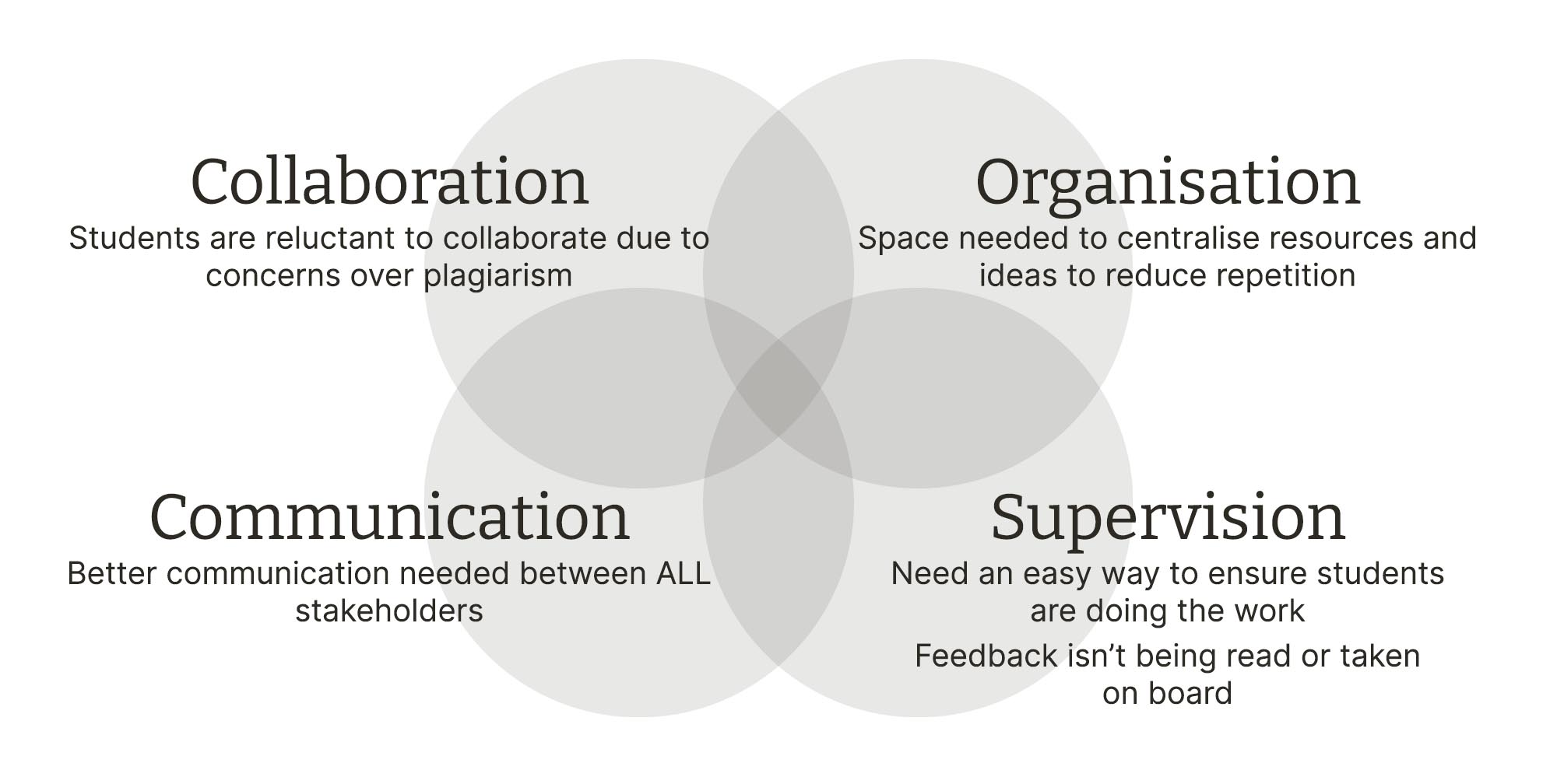
Key Insights Summary
The following were key insights taken from the most noticeable trends
RED FLAG!
Time to Check Ourselves and Re-Focus
Onboarding Vs On ProjectA recurring theme from the interviews was a need for onboarding to help “level up” student’s skills and knowledge base before the project begins. This was cited time and again as a blocker to the central aim of our platform which is to encourage collaboration.
To address onboarding would be a detailed piece of work and take up all our time until the end of the sprint. To ensure we achieved our primary goal of delivering a Minimum Viable Product we made the crucial decision to divide the problem in to two key focus areas “on boarding” and “on project”.
We would now move forward with the singular focus on the “on project” platform design.
Student Vs Supervisor as Primary User
Furthermore, we decided to progress with the Student as our primary user. The Supervisor would have different features and dashboard views which would increase the workload. We also identified that these features would likely be derived from those developed for the Student user.

Competitive Comparative Analysis
Plus/Delta
We next carried out a Plus/Delta analysis of the following competitors (direct and analogous); Crowdhelix, Telanto, NovoEd, Storium Education and Y-combinator. This gave us context to take into the design studio the following week.

Defining The Problem
Gamification Breakthrough and Personas
We had a breakthrough idea at this point which was to add an element of gamification to the platform that would help encourage engagement and collaboration amongst the project group.
The idea was to nominate a student team leader on a rolling fortnightly basis:
- Engagement would increase by giving students additional responsibilities for a period of time
- Collaboration would be encouraged by the team leader on their watch
>Problem Statement and HMWs
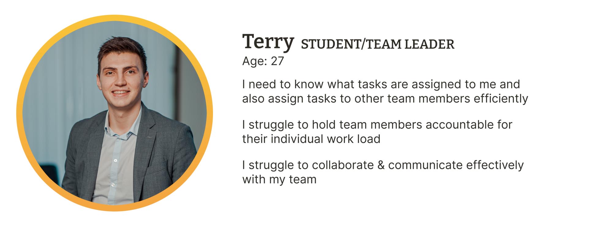
With the Terry, the student team leader, as our primary persona we began to crystalise a problem statement based on his needs.
Terry needs a way to effectively manage and collaborate with his team so that he can ensure they are on track and meet deadlines efficiently.
Encourage a proactive and considerate work ethic amongst the project group?
User Flows
The key to Terry’s Problem Statement and our HMW was that they involved an additional level of team management that our secondary persona, the student, would not require.

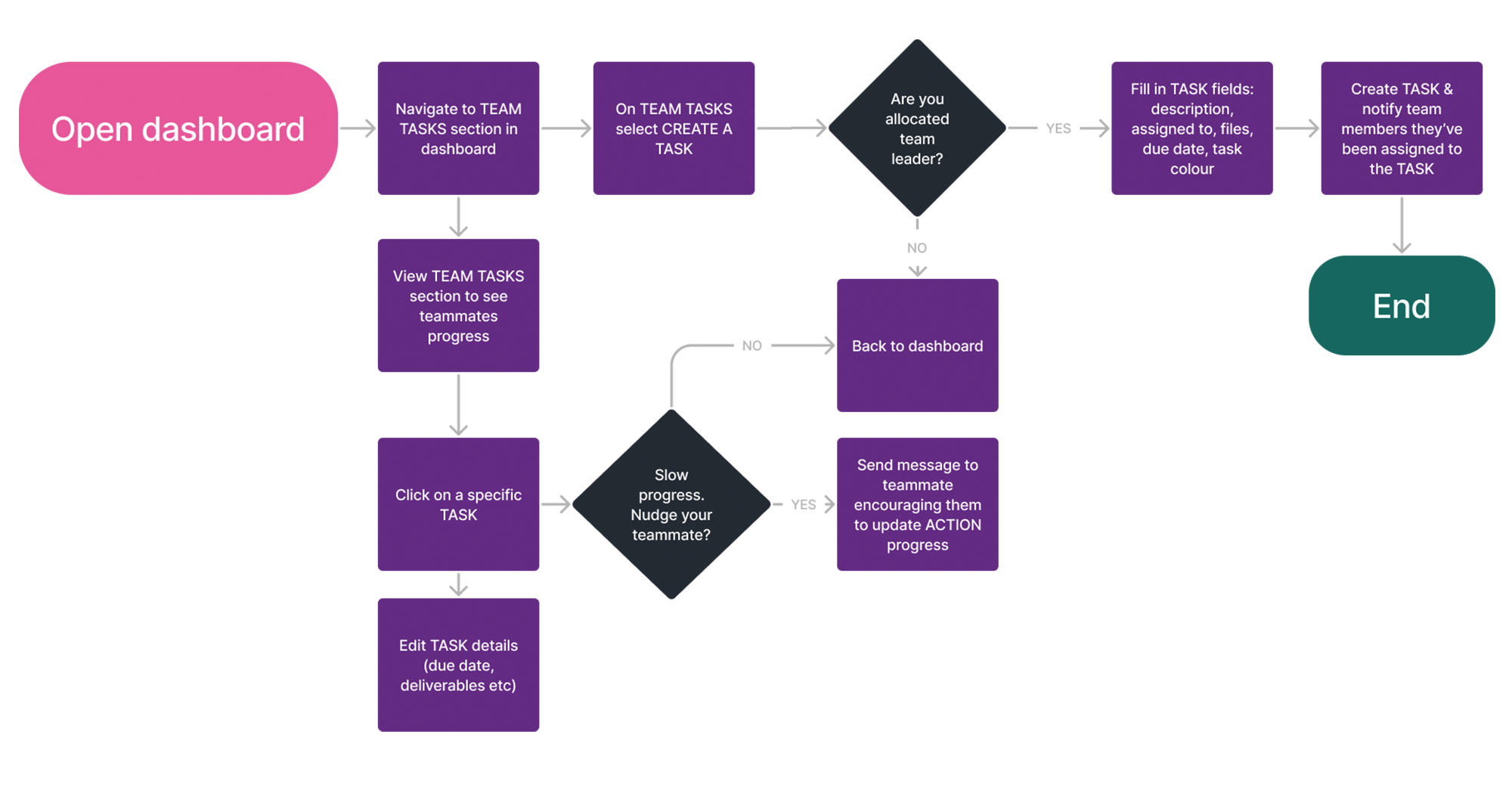
Team Leader User Flow
- Additional functionality Terry is given with his uplifted responsibility during his tenure as leader
- Allows Terry to create team tasks including features such as setting objectives, deadlines and deliverables and upload resources for reference
- From his dashboard he can allocate a task to a specific team member or group of team members and monitor how their actions progress as the week passes
- Terry can also message team members or check in with them via a chat function
Student User Flow
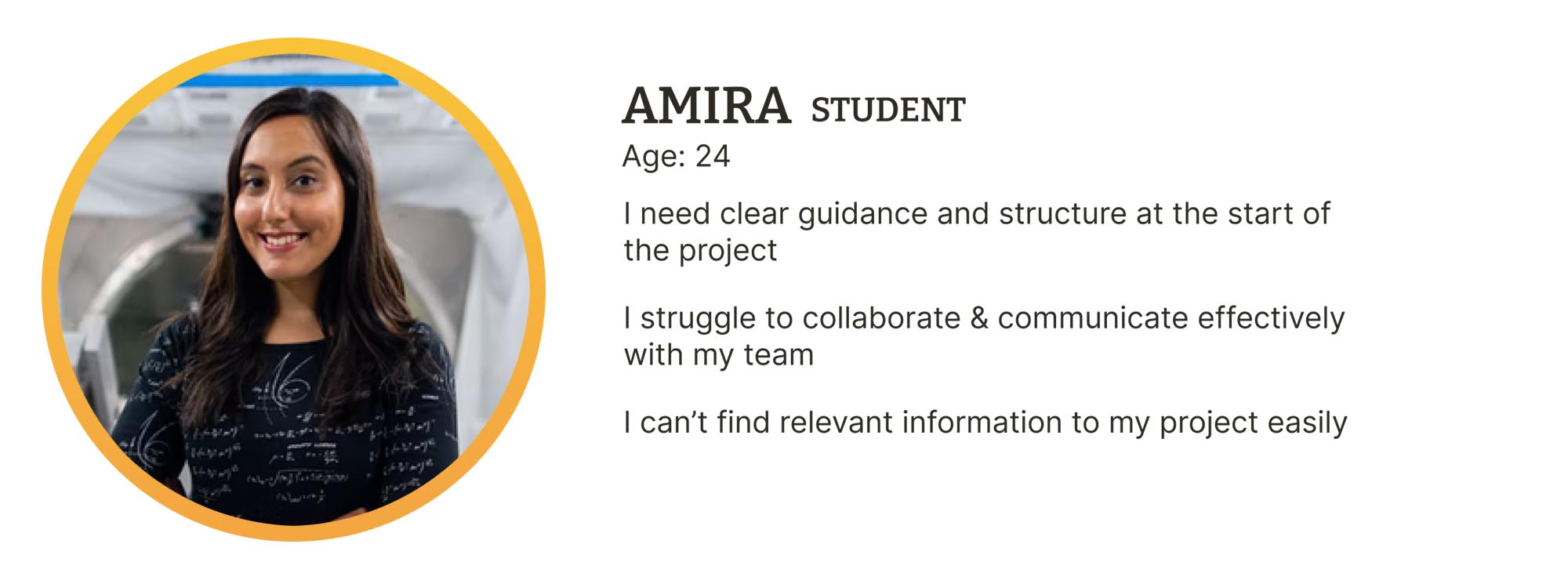
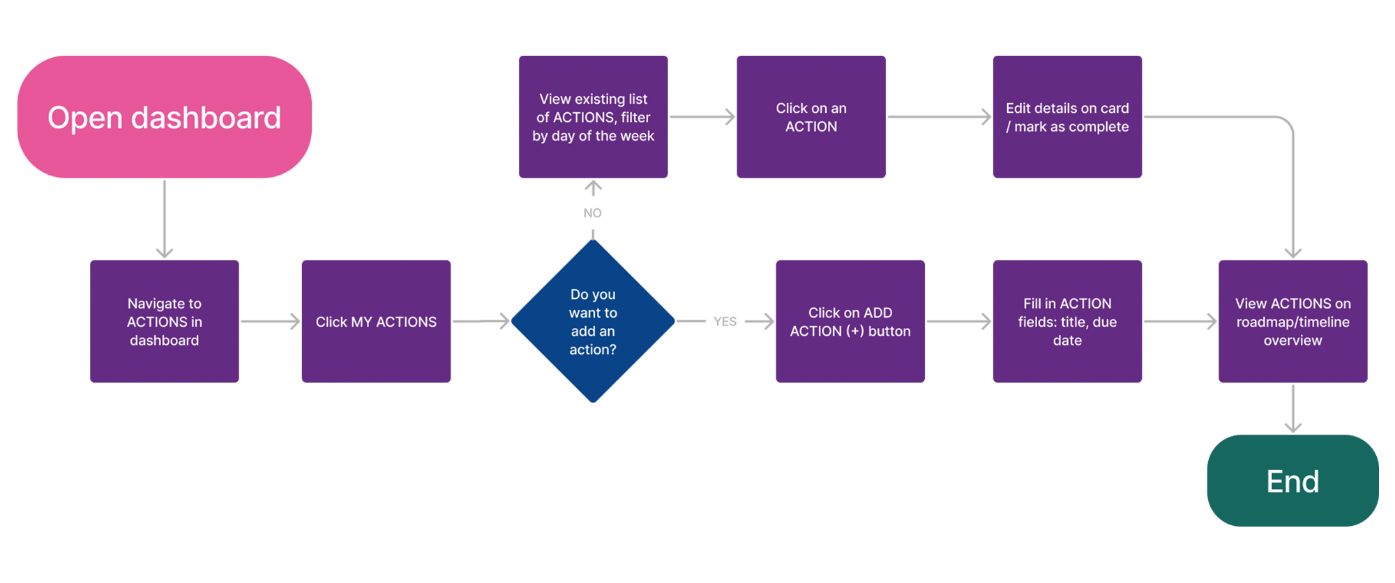
- Amira's flow demonstrates functionality which all team members have access to and focuses on creating a list of actions they need to carry out to contribute to the completion of a team task
- Features include setting deadlines to suit the individual students schedule and the ability to check items off the list as they are completed. Data is then tracked back in to the team project area for all team members to view
Ideation
Design Studio
Supported by the team I put myself forward to lead the design studio with the client. After a brief introduction to our research and define work we went in to our first round of sketching with the following context and scenario:
Context
- Students are disorganised
- Students don’t work collaboratively
- The assessment tools do not provide interesting outputs
- Repetition of information/feedback places an unnecessary burden on supervisors
The Scenario
How Might We…
Streamline the project process and better engage students, while helping them with organisation and collaboration?
Widgets, Timelines and the Infinite Scroll
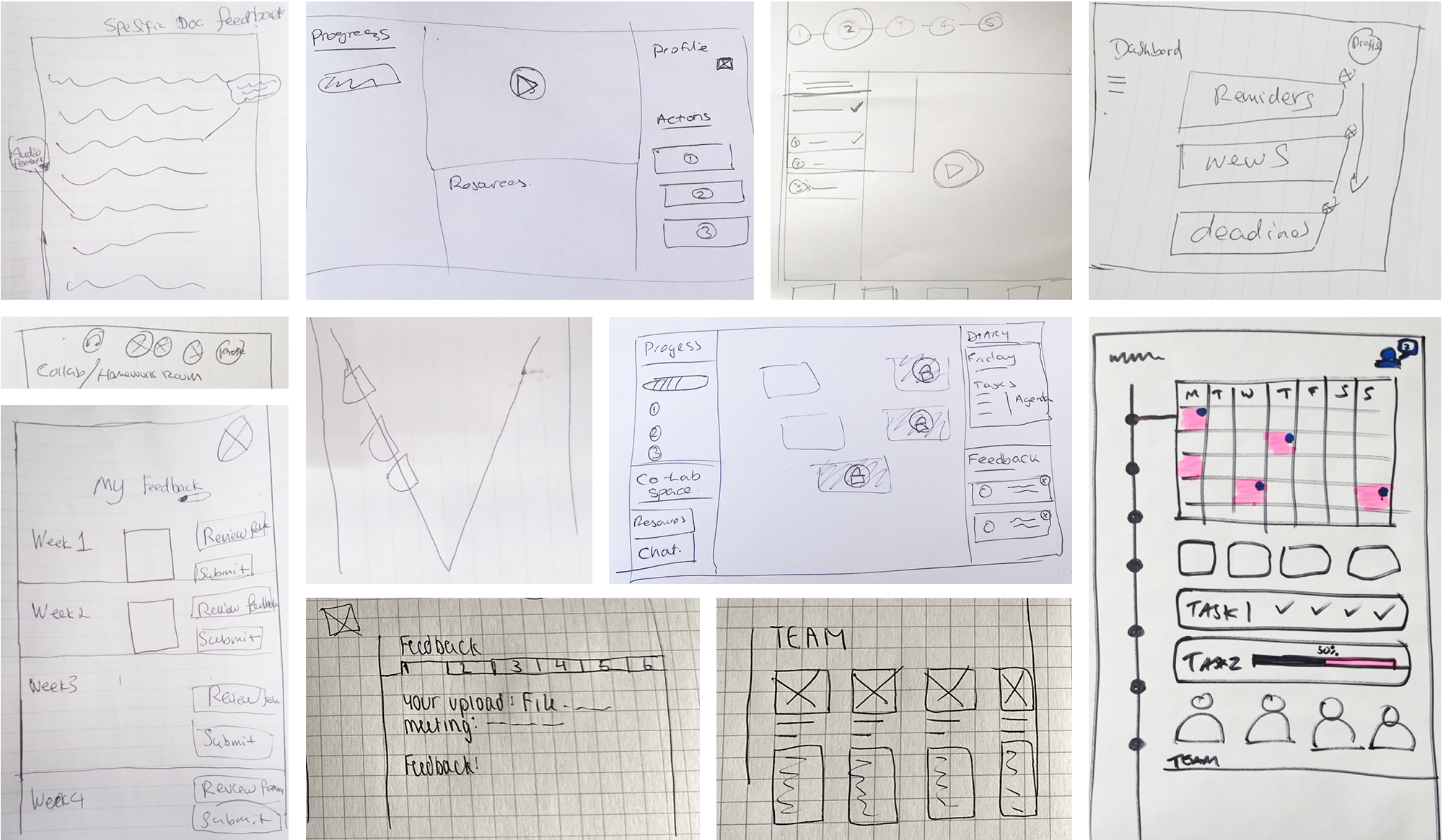
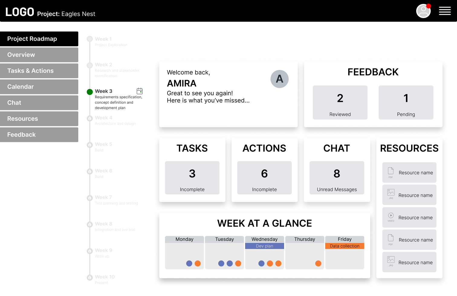
The output from the first round of sketching was fruitful and after presenting in the round we iterated twice on the preferred design: A dashboard connected to the project roadmap which would give students access to all the project content and management tools within the context of an infinitely scrolling timeline.
Initial Ideas
Iterating Lo-fi Wireframes
This basic concept was taken forward by team mate Jess who worked up more detailed lo-fi sketches of specific features.

Mid-fi Wireframes
I then blocked in these sketches as flat mid-fi wireframes in Figma for team review.
Information Architecture
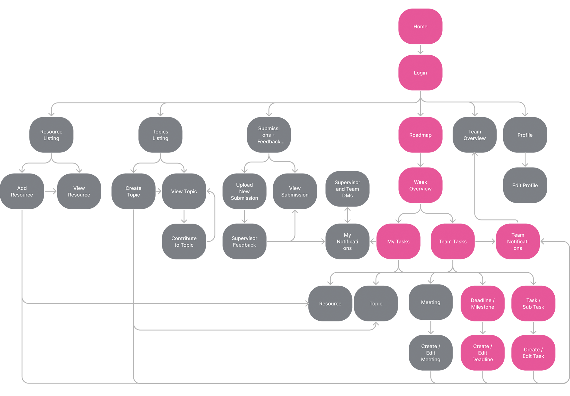
Due to the complex nature of the growing feature list we decided to give context to the flows we intended to test. This site map helped fill in the blanks for our first mid-fi prototype where we felt it necessary to have key global nav items such as "Resources" and "Discussion Topics" visible to provide a fully formed picture for the users.
This site map shows the overview of the platform for a student when logged in. The pages marked in pink represent the flows we were setting out to test.
Confronting the Elephant
"Who are SOSE?"
Quote from student user interview
We were now due to go in to prototyping and testing so we had to finally confront the elephant in the room: There was no design system let alone a brand to work with. Furthermore is had become apparent over the course of the project that one of client’s business goals was for SOSE to stand alone and for the platform to have it’s own unique identity.
Being the most experienced visual designer on the team I set about developing some ideas that we could work with.
The concept slides shown below were based on using the name and identity of the “V Lifecycle” as a mnemonic to constantly remind students of the methodology they should be following:

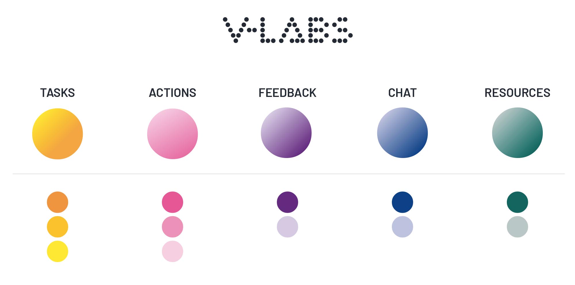
A key brand characteristic was that it needed to have an extensive colour palette. In addition to it being bright and playful it could be used to colour code various functions within the platform:
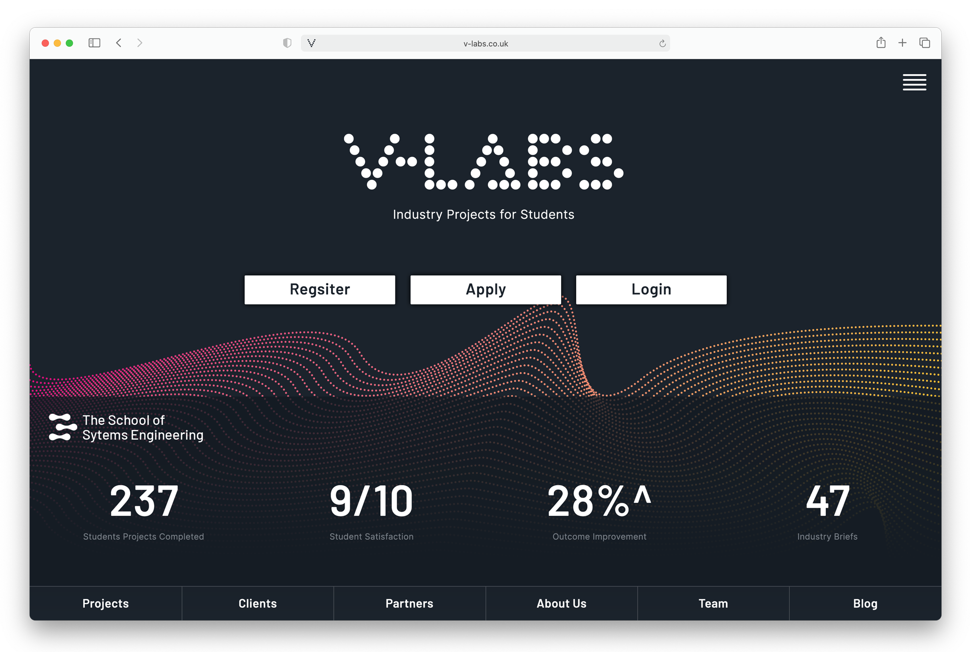
It could also be applied in a pseudo-scientific rendition to align with the SOSE parent brand if required:
Prototype Iteration and Remote Testing
Mid-fi Prototype
Working as a team we put together the mid-fi clickable prototype. Being confident in Figma I worked on the more complex elements including the global navigation and Project Roadmap navigation for the infinite scroll. The latter we felt was worth investing time in as we wanted it to simulate - as best as possible - the final product experience to give us the most useful test results.
Iteration 1 - Remote Unmoderated Usability Testing
Using Maze remote testing software we created three user assignments based on the team leader (Terry) having to organise and collaborate with his group.

Assignment 1 (creating a Task) was largely successful. There were however some issues with assignment 2 and 3. Further analysis of the heatmaps from Maze revealed insights which were factored in to an interim iteration and round of testing that we carried out with classmates to sense check our changes.
Iteration 2 - Interim Remote Unmoderated Usability Testing
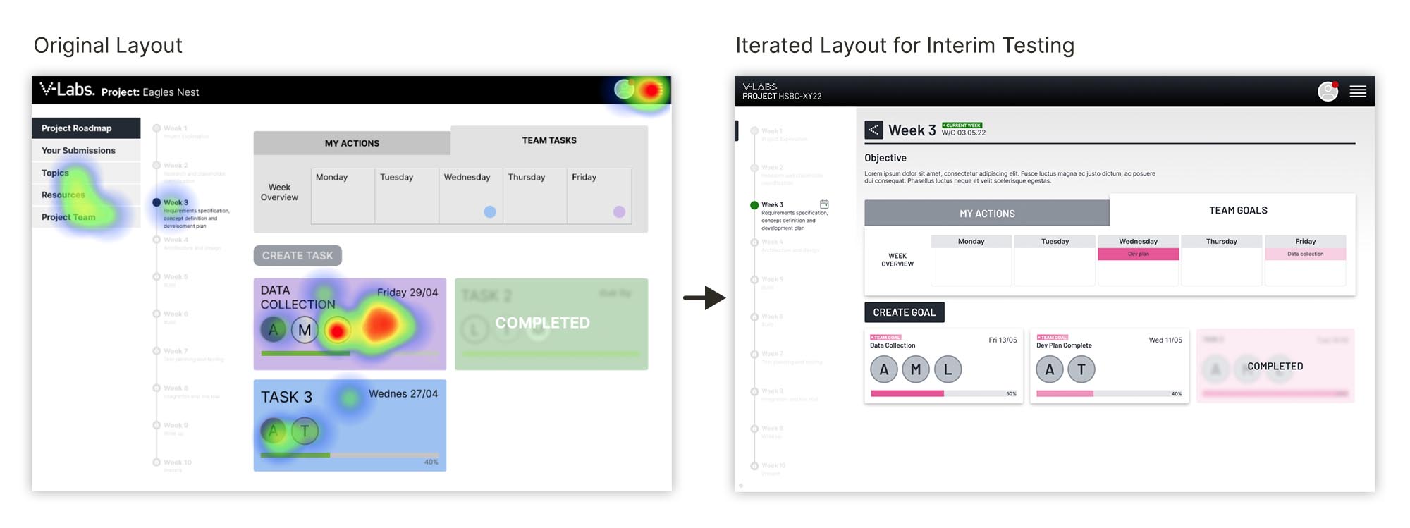
When asked to select the data progression task for that week some testers clicked on the main menu to the left instead of staying on the current weekly page. To signpost that they could access the information they were after in the current page we slid the menu left, out of view, allowing them to focus on goals for that week alone.
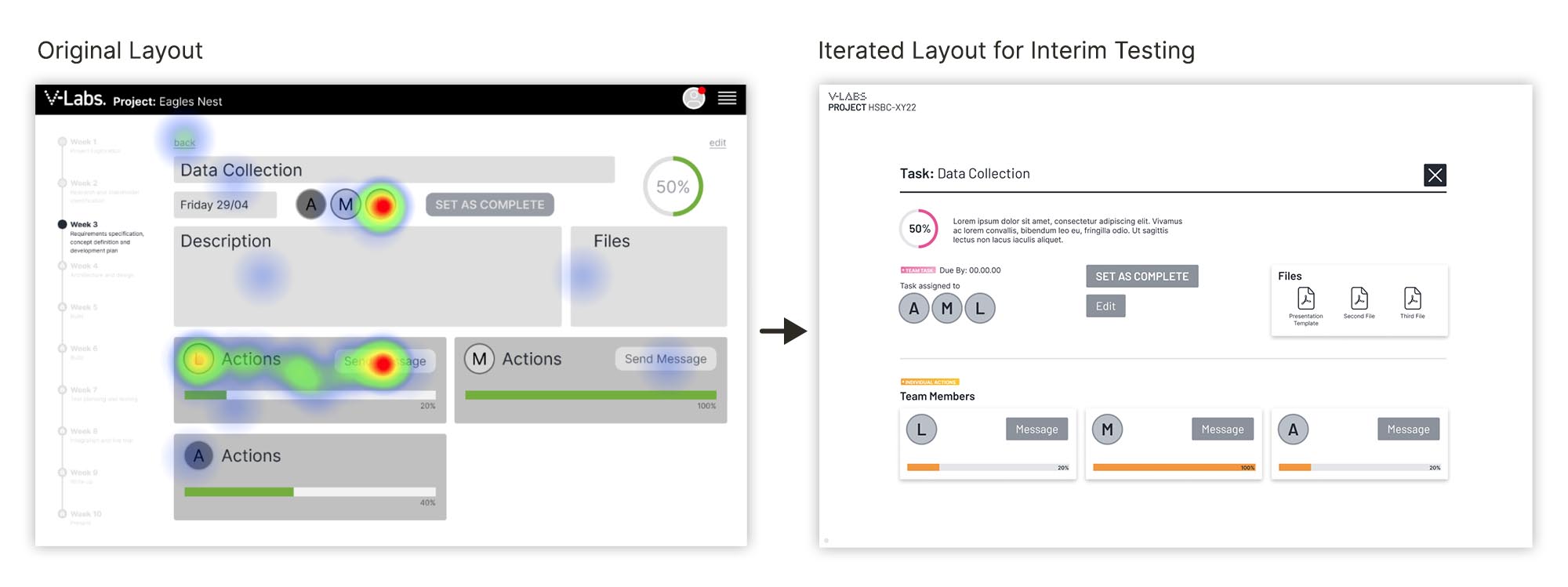
Users were also asked to contact Lucy (a team member) but seemed inclined to select several buttons on the page. We decided to emphasise the separation between them (as Terry the team leader) in the top panel and each individual team member located below on the smaller panels making it easier to view how each were progressing.
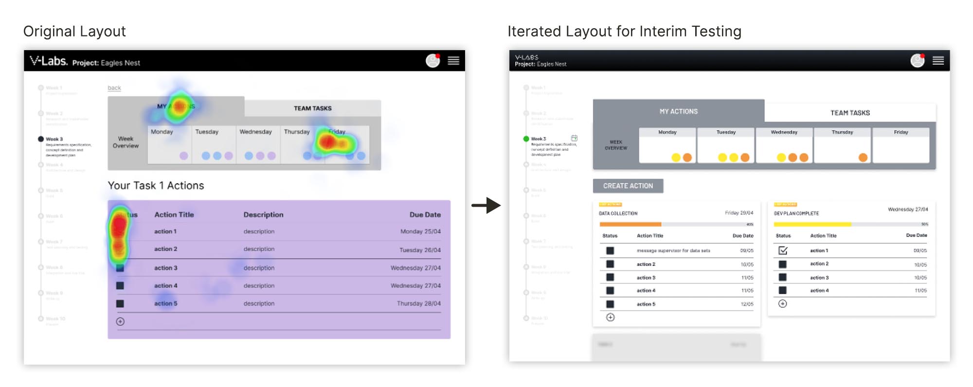
As a key element of the collaboration concept was gamification we adjusted the layout and placed more emphasis on visual data such as progress bars.
Hi-fi Prototype
Iteration 3
With the end of the sprint fast approaching and the necessity to present a hi-fi prototype we decided to prioritise a round of "quick win" changes before we carried out a final round of moderated usability testing.
This round of testing was conducted with two students who had taken part in our previous tests and initial interviews.
Changes included:
1. More effective visual hierarchy, improved UX copy and sign-posting.

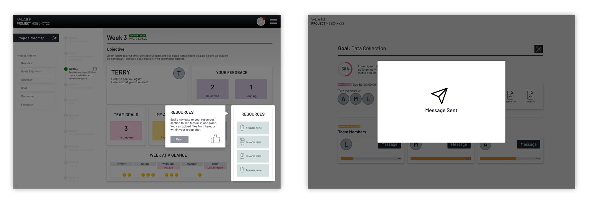
2. Better housekeeping of assets and design system for handover. This also enhanced the UX for testing through improved consistency and alignment of elements on the page to reduce unexpected behaviours and distractions from the task. The most obvious improvement was toggled content areas that now seamlessly transitioned.

3. Better signifiers for status and progress to notify the user of completed actions.
Remote Moderated Testing and Interview Summary
To summarise, our final round of testing and interviews went well with positive feedback from both interviewees.
"The simple layout makes complex info easy to read"
"Useful visualisation of all the elements on the homepage"
"I like the function to message teammates on the task page"
—
"Hey Brandon and Kim,
I just wanted to drop you a line and say tank you for allowing the School to come onboard for a sprint. My design group were AWESOME! I’m thoroughly impressed by their results."
Connor Miller
Founder, The School of Systems Engineering
Next Steps and Reflection
Next Steps
If we were to continue working on the project we would look to further develop the platform in the following ways:
- We roughly built out sections for the Project Archive pages which didn’t have branding applied to or were tested due to time constraints so these would need to be tested and built. The Submissions and feedback process for both the user and group would mean the students can continually learn and develop over the course.
- Other pages to design would include the Calendar overview page and Topics and Chat pages.
- We recognised resources were also crucial to the SOSE goal of embedding ‘Systems Thinking’ into their project process and this would also be an important feature to build out.
- Future goals: Given the multiple processes and large scope of the project from applying to completing there are many elements to develop including onboarding and application, and modules to help induct students into the roadmap process.
- Getting students out of ‘lecture halls of theory’ and into industry is a big feat. Our research insights involved pioneers so ongoing data will enable the platform to develop along with its users needs.
- Finally, understanding how the platform would work for Alex the supervisor, Terry the academic and not forgetting Chris, the industry professional supplying the projects, would be crucial.
Reflection
The project was a challenge to say the least! The scale and multifaceted nature of the brief was problematic given the timeframe we had to work to. If I could change one thing it would be to have had the client present for stand ups each morning to discuss blockers or clarify any business related queries that had come up the day before.
That said it was an incredibly productive sprint which threw us in at the deep end of research. An area in which I happily wanted to have a deep dive.
