
"I Saw Them First"
Helping music fans discover emerging artists playing at small venues nearby
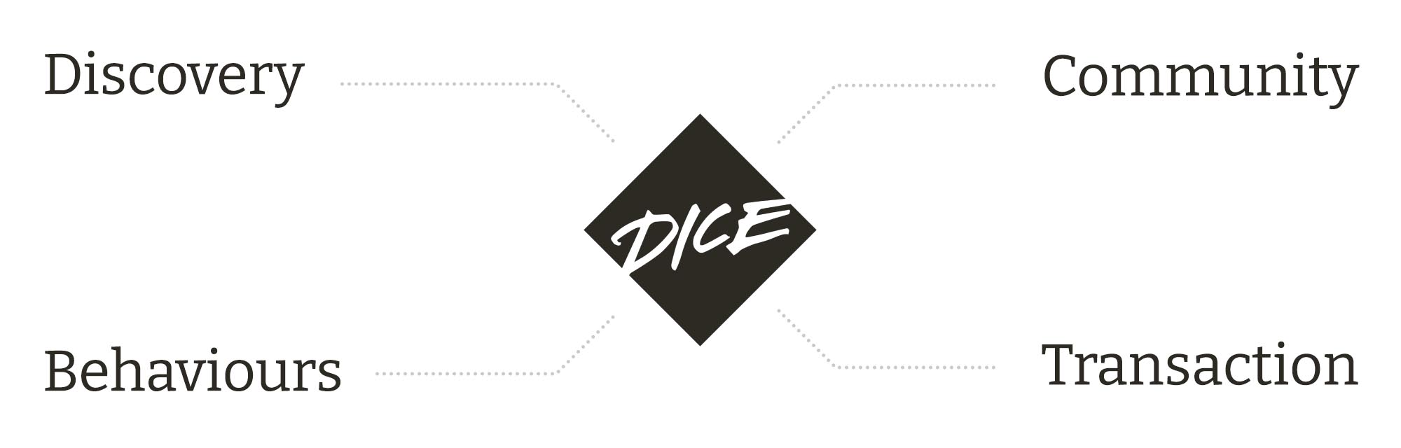
Client: Dice FM (Concept Project)
Project: Team 'High Rollers' project at General Assembly
Date: March 2022
Duration: 2 week sprint
Role: User Interviews, Data Synthesis, Ideation, Prototyping
Methodologies Used: Comparative Analysis, Task Analysis, Screener Survey, User Interview, Affinity Mapping, Personas and Scenarios, Problem Statements, HMWs, User Flow, Ideation, Wireframing, Prototyping, Moderated User Testing
Tools: Zoom, Excel, Google Forms, Figma, Figjam, Paper Sketches
Team: Saira Boardman, Nicole Kurrasch, Kunal Tailor, Tom Rapacioli
Brief
Dice FM is a mobile ticketing platform and native app that connects fans to live shows. They identified massive untapped market potential in selling tickets to see emerging artists playing at small venues. Planning on building a subscription service, which will enable users to discover and attend new live shows tailored to their likes and location, Dice wanted to explore opportunities to encourage music fans to take a gamble and buy tickets to see a new artist in an unfamiliar venue.
Challenge
Our challenge was to design a new feature within the existing app to exploit the identified opportunity area.
Solution
Our two part solution utilised both gamification and an auditory experiential approach. With a simple, visual path to curate the user’s personal preferences, our feature leads them by the hand to discover new sounds and places them right at the gateway where they can complete a ticket purchase whilst still listening to the music they’ve just fallen in love with.
Read on to find out more…
The Journey
Introduction
It was our first project together as a group so the first step was to establish working norms and set out our team charter.
As part of this session we mapped out the stages of work aligned to our deliverables on a Kanban board. This followed the EDIPT format i.e Empathize, Define, Ideate, Prototype and Test...
We had a lot do get done in the two weeks ahead!
To hit our milestones we assigned tasks to the four team members to ensure no-one was doubling up – happily team bought in to the idea of the common goal.
Being a stickler for planning I wrote up the project schedule. The running order was as follows:
Week 1
Day 1: Screeners and competitor research
Day 2: Review screeners, discussion guide, recruit for interviews/conduct interviews
Day 3: Affinity mapping, synthesis, primary persona
Day 4: Problem statement and HMWs, user journey, design studio (crazy 8s/sketching)
Day 5: User flows and wireframes
Week 2
Day 1: Mid-fi prototype, presentation set-up
Day 2: User testing and analysis, design system set-up
Day 3: Hi-fi prototype
Day 4: User testing and analysis
Day 5: Present
Research and Empathise
Screener Surveys
Our first stage of research was to send out screeners to gather initial insights and begin recruiting for interviews.
"Age ain’t nothing but a number"
The data threw up some interesting results and challenged assumptions including the target user base which was looking to be older than we anticipated. The largest segment of respondents (47%) was in the age range of 36+.

862 Capacity
Definition of a small venue
Only 20%
Read reviews to decide on a night out
We also discovered that users perception of a “small venue” was an average capacity of 862 people and interestingly that only 20% of the respondents said they used reviews of live shows and venues to decide what tickets to buy.
Some of our assumptions were also confirmed to be correct including:
- People normally go to gigs as a group with one personal organising all the tickets
- Most people plan ahead and rarely go to gigs last minute
Competitive Analysis
Feature Inventory
With the interviews scheduled in we began looking at competitors including ticketing and venue sites. We set up accounts with and thoroughly reviewed the features on Songkick, Today Tix, Live Nation, Jazz Café and LNZRT* which we felt were the closest competitor matches in the sector.

*LNZRT operates as program partner with venues like the Moth club and ticketing sites (including Dice) to produce and promote events by building visual identity.
Task Analysis
We also carried out a task analysis of the user flow to buy tickets on Dice FM alongside Facebook and the O2 Priority app.

Key Findings
- We discovered the competitor apps had a more streamlined process with less clicks to purchase than the current Dice flow
- Another key difference we discovered was that Facebook was more “social” focused while 02 Priority was more “event” focused
User Interviews and Affinity Mapping
Next we recruited four users for interview the following day.
Armed with our initial data from the screener we brainstormed a topic map to inform our discussion guide. As shown below this highlighted four key areas for discussion which helped bring structure to our interview script – although of course it was kept loose to allow the interviewees scope to elaborate.
Topics to explore:
The interviews threw out a huge amount of interesting data. We took it to the whiteboard and affinity mapped it in to order. We could now see patterns emerging in terms of pain, needs, wants and behaviours which enabled us to form a picture of the key issues to address.
Key Quote
"You either get 'big gigs' or 'pub singers', there's no in between. I wouldn't know where to go to find an artist with credibility and experience but still trying to make it."
Other trends that stood out
"My kind of vibe, my kind of people"
Users needed reassurance when taking a gamble on a new artist or venue. They needed to feel sure that the event would match up their "vibe" and that the audience would consist of their "kind of people".
"I love physical tickets!"
Users also wanted to feel some sort of tangible connection with the event that in the past may have been a ticket or flyer.

Defining the Problem
Primary Persona
We started to feel we had a grasp on the project and our efforts could be molded in to a persona.

User Journey
Alongside Didi's persona we plotted his user journey to help visualise where and when his pain and frustrations kicked in. We produced two current state user journeys; one restricted to the ’in app’ experience and one that included going to an event itself.
It was clear that 'in app' he was at his lowest ebb at the point he felt he didn’t have enough information about an artist or venue. At this point he played it safe and looked to book for a known artist and venue. This was informed by his previous experience of arranging tickets for friends and the group being disappointed with his recommendation.
Problem Statement and HMWs
The next step was to crystalise our findings and produce a succinct problem statement.
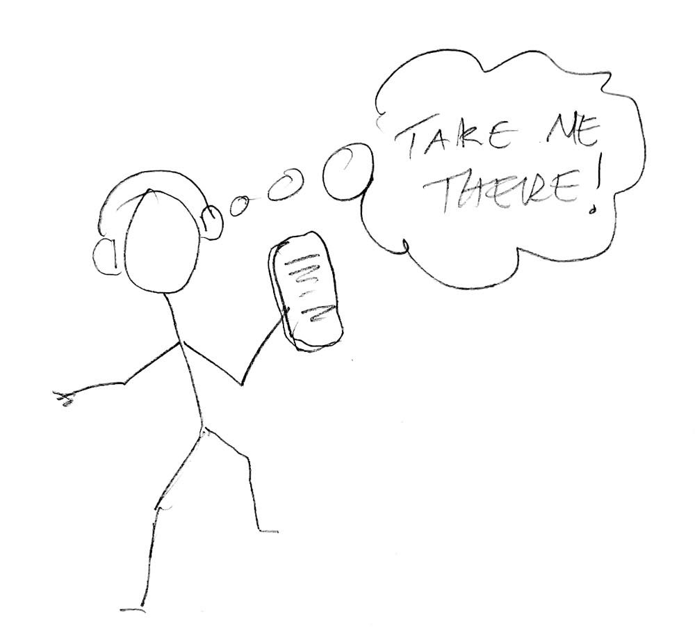
Didi needs to be 'in the know' about hidden gem venues and upcoming shows so he can discover talented artists that aren’t mainstream, while vibing with 'his kind of people'.
Great care and effort went in to crafting the problem statement along with the HMWs that we were to take in to the design studio at the next stage.
How Might We play matchmaker?
The idea of framing the new feature in a similar way to how a dating app might connect with Didi's vibe really resonated with the team as there seemed to be a lot of parallels in what we were trying to achieve for him.
Ideation
Design Studio
Hallelujah!
Leonard Cohen
We held a design studio in two rounds. Initial concepts (Crazy 8s) which were then presented in the round, discussed and voted on, followed by an iteration on the preferred routes.
Two distinct concepts came out of the design studio that unanimously got the team vote to carry forward and develop...
1. A preference setting system based on a visual moodboard. We felt it could be great way to connect the visual aesthetic of Didi’s vibe with that of the artist and venue.

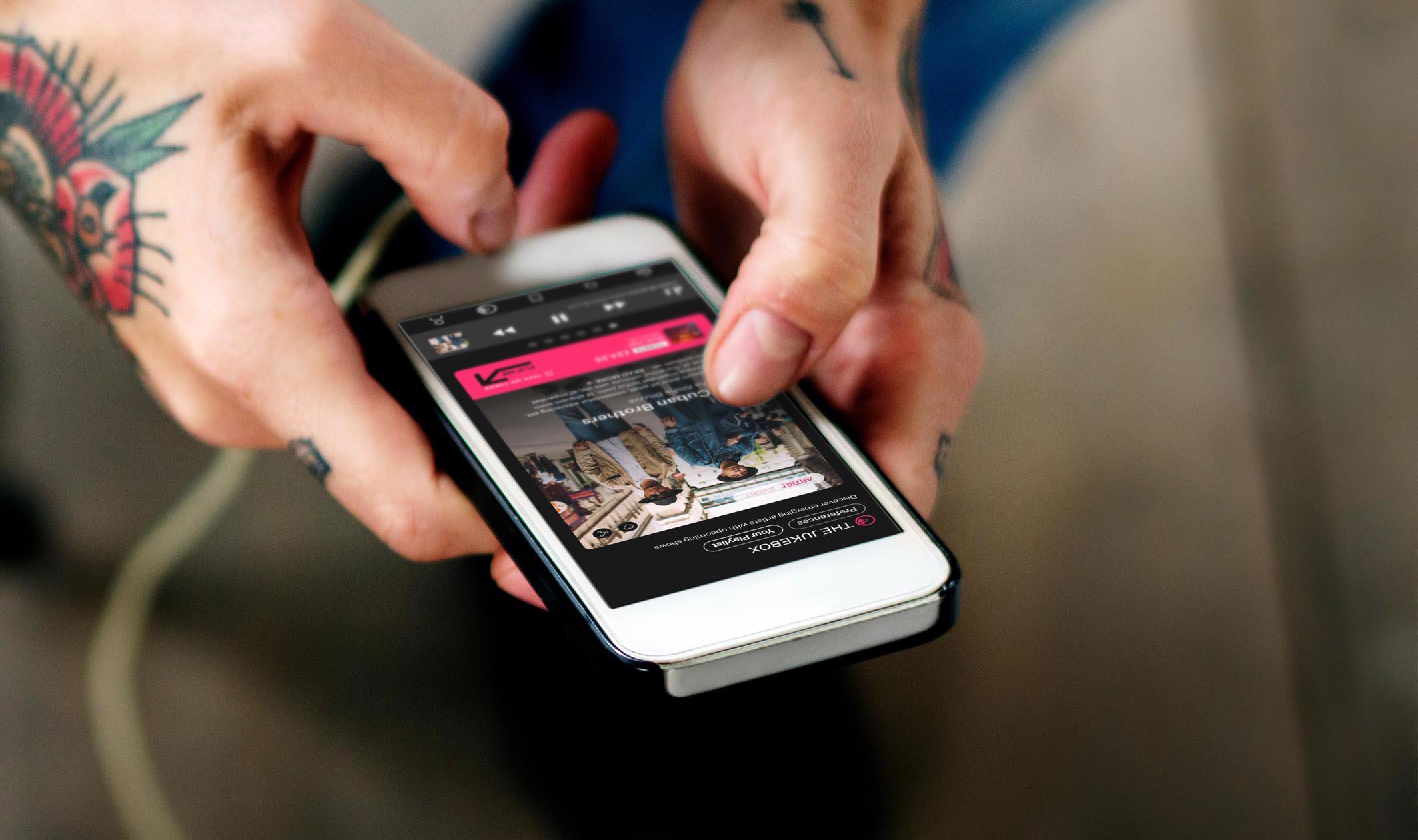
2. The second was a jukebox feature that selected tracks based on Didi’s preferences. Remember that feeling of hearing an amazing song for the first time that hit you right between the ears!
Iteration
One of the stand out pieces of research from our interviews was that Didi really missed the tangible aspect of going to gigs i.e having a ticket or flyers in his hand.
Why Can’t I Touch It?
The Buzzcocks
Developing the Jukebox Concept
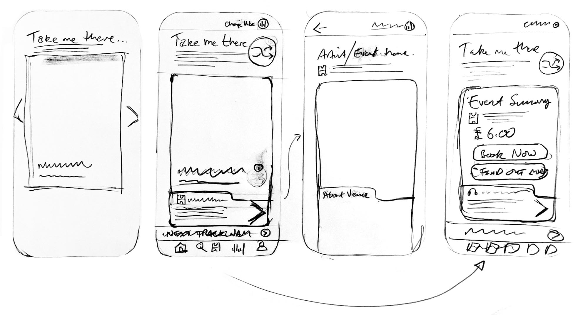
The idea that jumped out was to have a UI element within in the jukebox that emulated a flyer. Whilst listening to music Didi can see the artist and track information but also simply click and flip the card to reveal information on the reverse about the venue.
Formalising the Concept
The concept had taken shape so we began to formalise our ideas by creating the user flows we wanted to test. As there were two stages to the overall concept (Preferences Moodboard and Jukebox) we decided to split out our flows as shown below.
User Flows
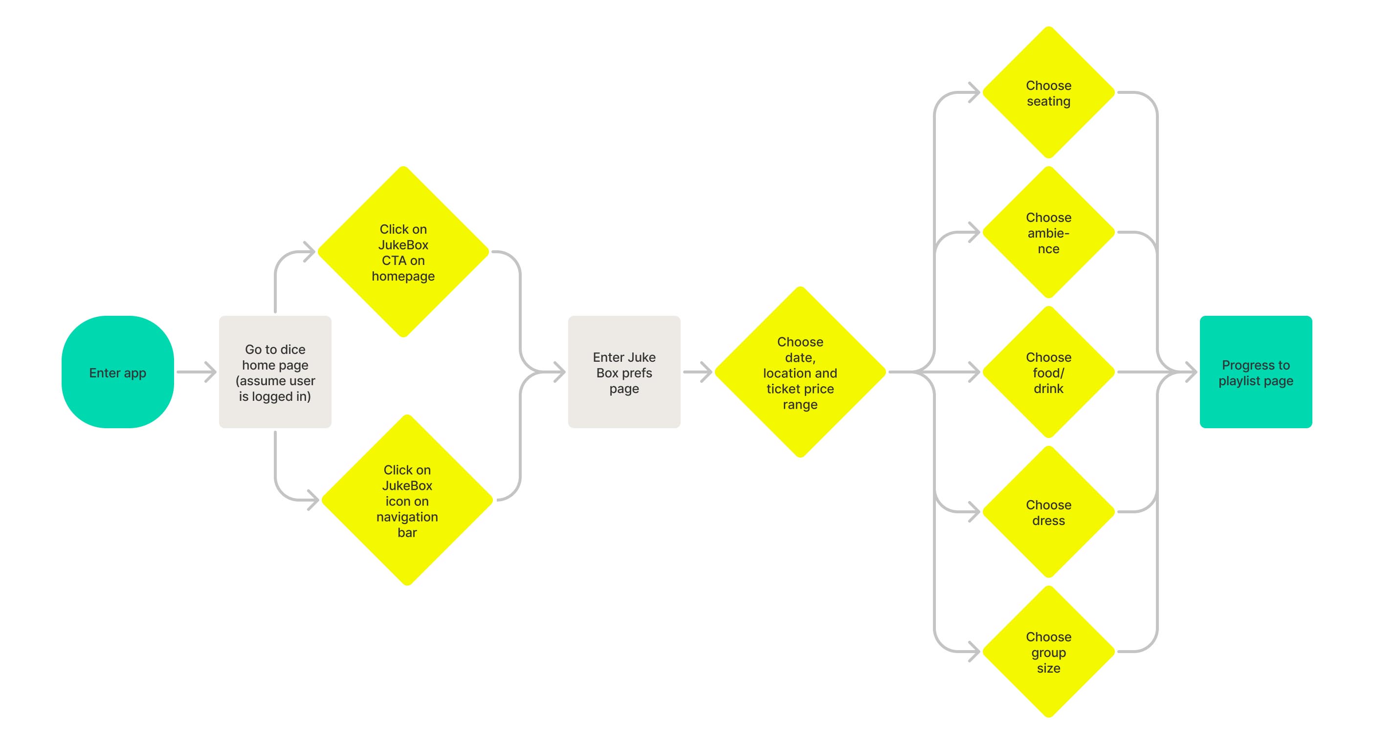
Jukebox: Flow 2

Prototype and Test
Wireframes and Mid-fi Prototype
Following this we worked up wireframes to block out components within page layouts. A key aspect of this process was to ensure our new feature could slot into the app and require minimal changes to the existing layouts and page structure.

Moderated Testing – Round 1
Our first round of testing brought up some really important issues with the initial design.
Preferences Moodboard:
Tier 1 Issues- Found that the categories set within the series of moodboards was vague and wasn’t clear what the sections represented
- Some of the images used to symbolise aspects of the users vibe were either too specific or just not relevant
- Found it hard to gauge how long the preference setting process would take
- So the images became distracting from the test itself - We realised this could be a significant piece of work to ‘get right’ so decided to do a quick card sort amongst the project team to refine the categories and select some better/less distracting images for the next round
- We also worked up a progress tracker to add in to the design and clearly signpost to the user where they were in the process
Jukebox:
Tier 1 Issues- Didn’t see the flip button, however still pressed on the green tab to flip the screen to book
- Didn’t associate player page as a flyer design
- Not enough information on the page
- Text to small
- From booking stage it was straight forward with no blockers
- The above issues were all fixed as part of a more refined approach in the hi-fidelity UI design with an emphasis on better use of screen real estate
Iteration and Hi-fi Prototype
The following designs show key page layouts where we iterated the initial design in-line with the findings from the first round of testing.

Next Steps and Reflection
Next Steps
If we were to continue working on the project we would look to further develop the feature in the following ways:
- Separate preferences from setting the vibe
- Run a card sort for categories that define mood board using both images and words
- Further usability testing “clickability” and readability
- Explore subscriptions and exclusive content related to the new feature
Reflection
Our team had a great time working on this project. Given our starting point – effectively strangers with limited formal training in UX - we all had huge learnings from a process and methodology point of view. However, from my perspective the most positive takeaway was the overall experience of working as part of the team and the pace at which we got things done. I really enjoyed taking a leadership role when appropriate and sought to create the space for others to contribute and collaborate where they felt comfortable and had natural strengths.
This was also an opportunity to really push prototyping in Figma – I took it to the limit in certain areas! Most notably that our card flip animation wasn’t possible using overlays. This required a last minute rebuild but we got there in the end! Also, a tiny detail that Figma doesn’t support audio playback so we had to think around that problem for testing… Knowing your tools can be a great time saver - You live and learn!!