
Blossom
A new eCommerce website design for neighbourhood garden centre

Client: Blossom
Project: Solo conceptual project at General Assembly
Date: April 2022
Duration: 2 week sprint
Role: Research Plan, User Interviews, Data Synthesis, Ideation, Information Architecture, Branding, Prototyping
Methodologies Used: Competitive and Comparative Analysis, Screener Survey, User Interviews, Affinity Mapping, Personas and Scenarios, Card Sorting, Problem Statements, HMWs, User Flows, Ideation, Wireframing, Prototyping, Moderated User Testing
Tools: Zoom, Excel, Optimal Workshop, Google Forms, Figma, Figjam, Paper Sketches
Team: Tom Rapacioli
The Client
Blossom is a neighbourhood gardening shop that is proud to be a part of their family-friendly community. The business model is based on customer service and keeping it local.
The Brief
They identified an opportunity to support the local community by allowing people to order products online. Through a user friendly eCommerce website, they want to showcase their products while maintaining their brand image: "small shop" appeal and great customer service.
The Challenge
As a small store Blossom are aware they can’t compete with large online retailer’s. They know their competitive advantage and appeal is that they offer a personalised, community based service. So how can this translate to an eCommerce website?
Read on to find out more…
Empathise
Through surveys and user interviews I sought to gain insights in to their needs and frustrations.
Surveys
Screener surveys were sent to gather initial data from the potential user base to feed in to our user interview discussion guide and begin the recruitment process.

Key Data
- Shopping with an independent retailer and quality of customer service were the lowest on their list of priorities
- Perhaps predictably, the majority of respondents stated their shopping habits were defined by convenience of service and deals
- The majority are also spending less than one hour gardening per week
From this data you could make a number of assumptions but the main one I wanted to examine at the next stage was that:
Users aren’t that bothered about quality customer service
As a key part of our brief we needed to understand more about what this means so the customer service element of the new website is relevant to our users.
Interviews
I interviewed four budding gardeners; Sue, Matt, Sophie and Jess to discover more about their experiences.
NB The interviewees were deliberately selected in pairs, from two age ranges (40 - 60 and 20 – 35), to establish if there were differences in the wants, needs and frustrations of their online shopping experiences.

Key Trends
I value expertise and advice
“Gardening is a specialist field, you need to know the basics but no matter how experienced you are there is always something interesting to learn.”
Sustainability and ethos matter to me
“I appreciate the natural environment. Knowing the retailer cares too completes the circle.”
Knowing I can go in store is reassuring
“Being able to see things before you buy them is helpful especially with tools and big items”
Hybrid shopping would be a great for me
“Being able to click and collect or order in-store with delivery would give me the best of both worlds”
I have experience delivery and transport issues
“I normally like to order in advance so I can plan my gardening days. So many times I’ve had delivery issues, especially where a large items can’t be left in a safe place”
The initial assumption from the survey data that our customers would want it quick, easy and cheap was proven wrong in the interviews. The interview research confirms that Blossom’s key businesses differentiators of small, local store offering a personal, friendly service is really what our users want but in actual fact it is specialist advice that they most value. There is also an interesting opportunity area around locality and "ways of shopping" to explore.
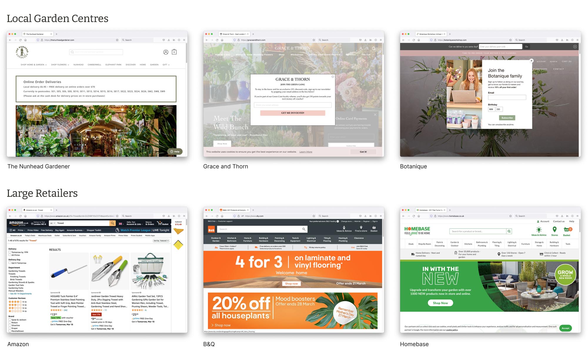
Competitor Research
I now conducted competitor research to gain a better understanding of the status quo in specialist online garden stores and other online retailers that could be considered as trade competitors. These comprised the following:
- Four local garden centres with eCommerce sites (specialists with a narrow inventory)
- Two large scale home depots (with comprehensive inventory)
- One global eCommerce retailer
The Benchmark
The benchmark website I found was Burford Garden Centre. This had a comprehensive range of specialist equipment and consumables, was easy to navigate whilst being presented as lovely place to visit, enjoy and linger whilst you shop.
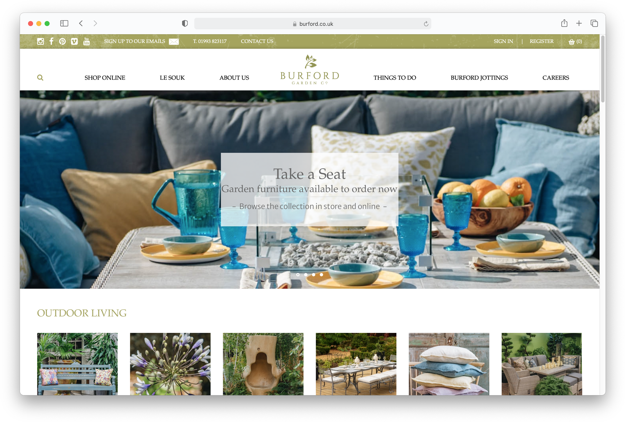
Key Features
Two key features from the Burford website stood out as things to consider for the Blossom eCommerce offering:

Key Feature 1:
Specialist Advice

Key Feature 2:
Interesting delivery options including free "local" delivery by their own vans and a product assembly “white glove” service.
Some of the smaller independent specialists present themselves as boutique and inaccessible but on the other hand the larger retailers didn’t offer any sense of personal service or appreciation of their customer's sensibilities. I would therefore look to find a middle ground that is specialist and friendly, offering a range of services to suit their customer needs based on their already established in-store operation (including delivery options). It could also welcome customers with a clear invitation to visit, meet the team and enjoy their in-store experience.
Define
In the define stage of the project I carried out the following exercises:
- Persona creation
- User journey
- Problem statement and HMWs
- Card sort
- User flow and happy path
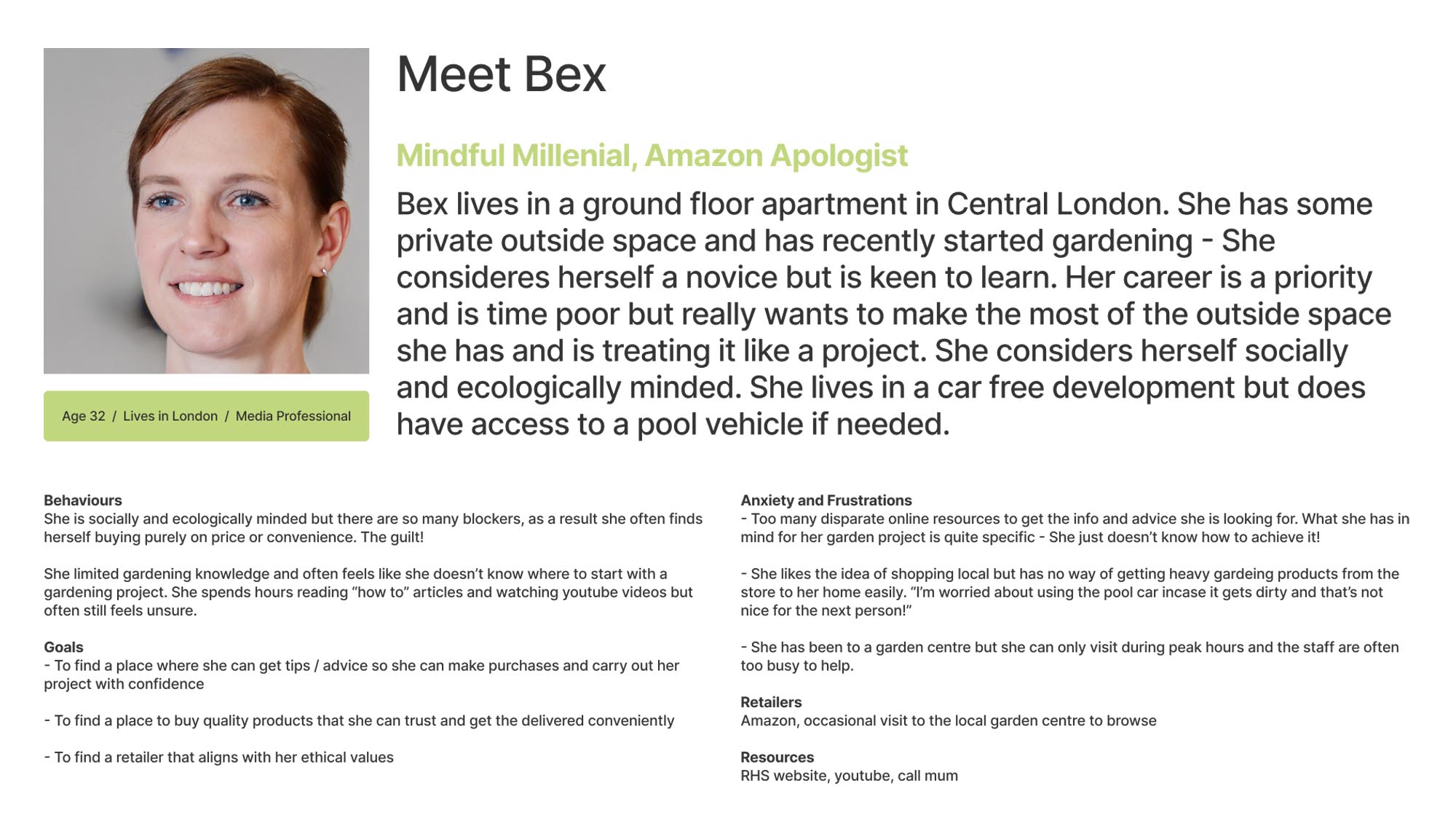
Our Primary Persona: Meet Bex
To keep me focused on our user and to give them a voice I created a primary persona based on insights gained from my user research.
Problem Statements and HMWs
To help keep me on task with Bex' main problem I crystalised the following problem statement.
Bex needs a convenient way to shop for garden supplies online, while receiving reassurance and specialist advice so that she can feel good about her purchases.
I now created the following HMWs to take forward in to the ideation stage.
- How might we reassure Bex by offering her a personal service
- How might we make delivery options a positive instead of a negative
- How might we make her shopping experience pleasurable instead of fraught with anxiety
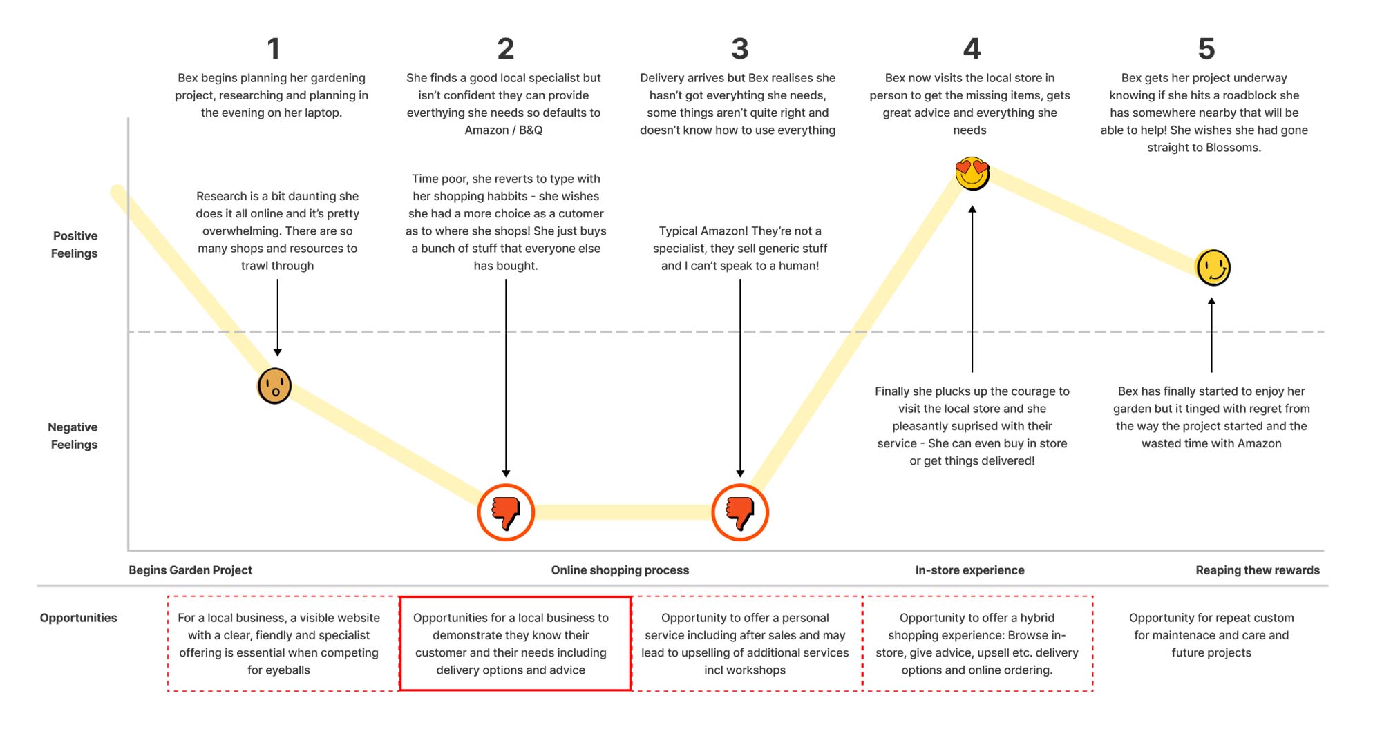
User Journey
A retrospective user journey to map Bex’ pain points was also created. I used this to identify/confirm opportunity areas within the journey.
Card Sorting
I was given a sample product inventory of 80 items in no particular order. To ensure Bex could find the item she wanted on the website with ease I needed to categorise the products in a way that would most intuitively make sense to her.
Rather than asking people to card sort all 80 items AND define the categories I carried out an initial desktop sort with a small group of colleagues using commonplace categories discovered during the competitor research stage.
- Watering & Irrigation
- Outdoor Living
- Tools & Equipment
- Maintenance & Care
- Pots & Planters
- Landscaping
- Flowers & Plants
From this we extracted a short list of 20 products that, we as a group, were struggling to fit in to a category. Using Optimal Workshop I sent out an invitation to my initial survey subjects asking them to sort these ambiguous products in to the best fit categories.
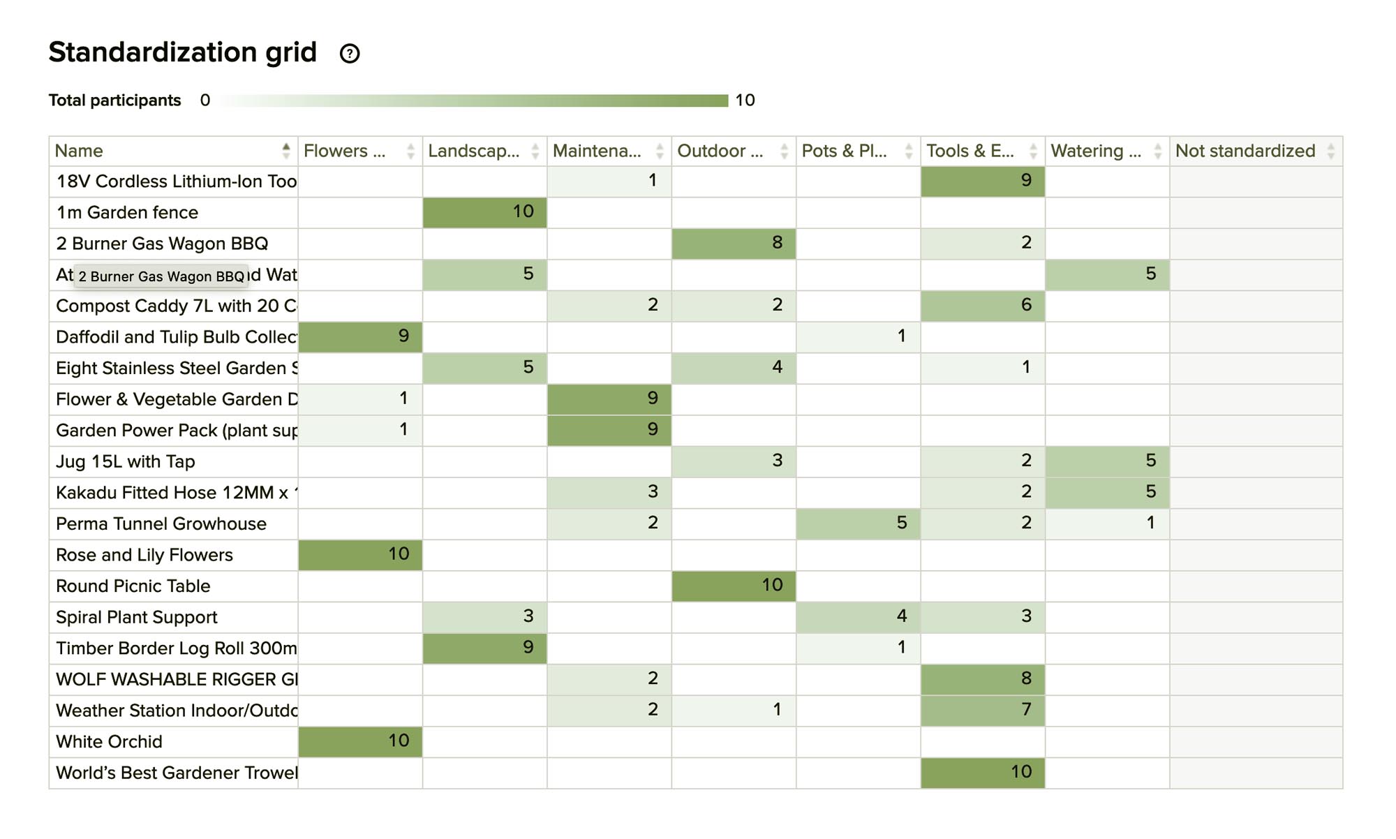
In all but one case we had a majority sort for each product. For the exception, in consultation with my colleagues, we decided the name and description of the product was ambiguous and we could work around the problem by more clearly labelling/describing it.
User Flow
The final exercise before heading in to ideation was to define the user flow and identify Bex' happy path to placing an order. This would help me focus efforts in terms of design to prototype but most importantly define the experience I wanted to create for her. Bex' user flow was set out as follows:
- Find product
- Ask our friendly expert a question
- Set up an account
- Make purchase

Identifying The Opportunity Area
In creating the user flow it became clear the main opportunity area was where the user could "Ask an Expert" a question. Here we could incentivise the customer to "join the community", unlocking additional features and services whilst upselling at the same time.

Ideation, IA and Design System
Crazy Eight
To free myself up after an intense week of research I set about conducting a round of Crazy Eights. This threw up ideas around membership benefits, forums and using the site to promote a virtual Community Garden using social media.

Sitemap and IA
I now created a simple sitemap in Excel outlining all areas of content the site would need to cover both in terms of eCommerce and brand positioning. The later included initial thoughts on member benefits and local community involvement to actively convey Blossom’s ethos of a friendly, accessible and inclusive local business.

Brand and Design System
With a background in visual design my first port of call was to establish some basic brand elements such as logo, typeface and colour palette. I wanted to push the branded element of the site as it had potential to be a visually impactful design but I knew this would also help with developing a harmonious and successful design system for hi-fidelity layouts.
Logo and Colour Palette
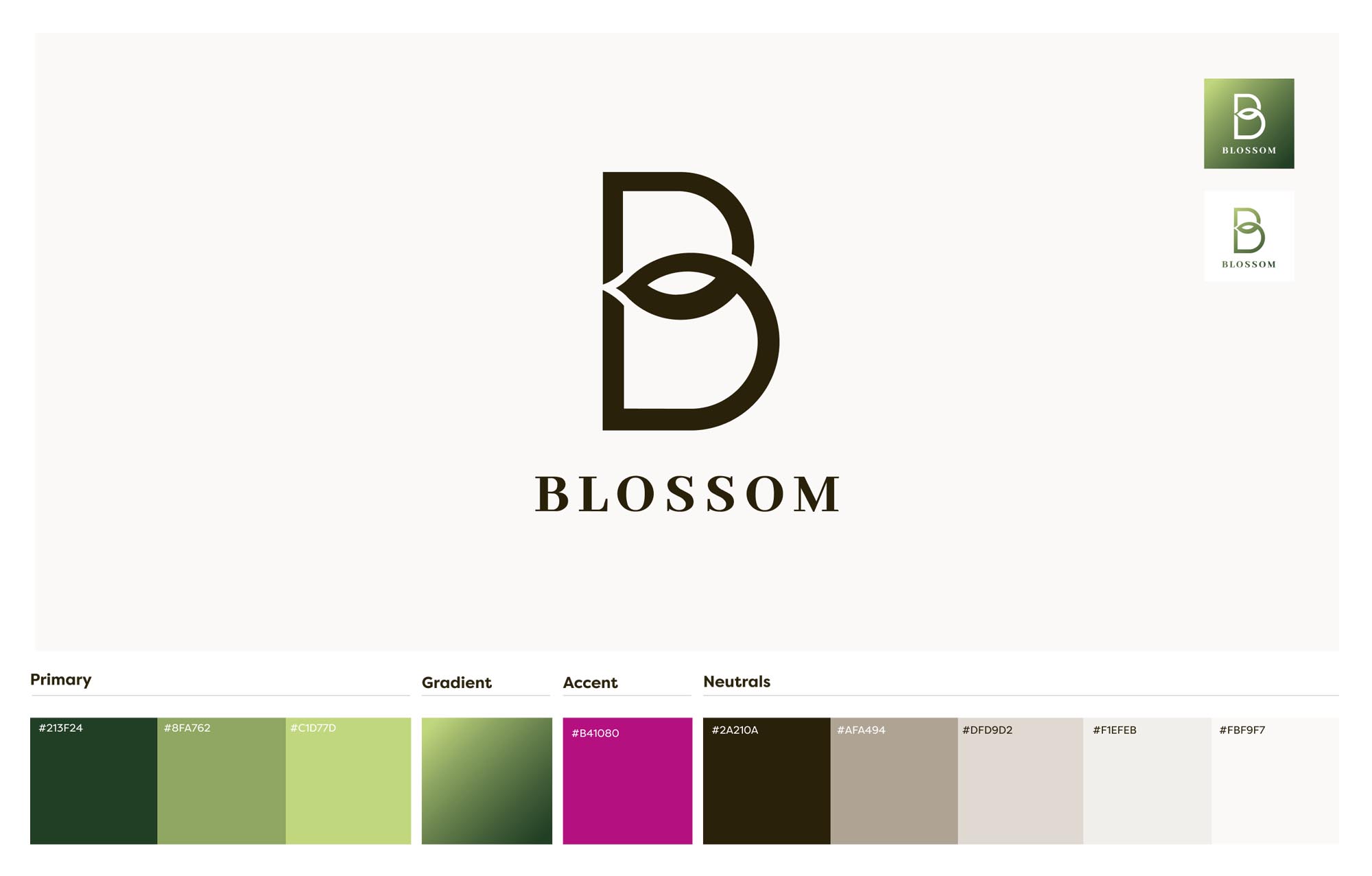
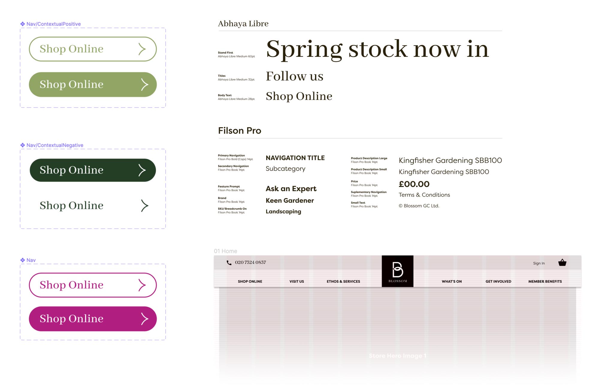
Basic Design System, Style Guide and Asset Library
Develop
Armed with ideas and a serviceable kit of parts I began developing a working design for testing.
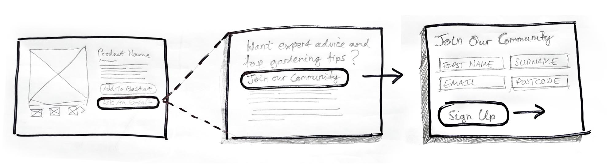
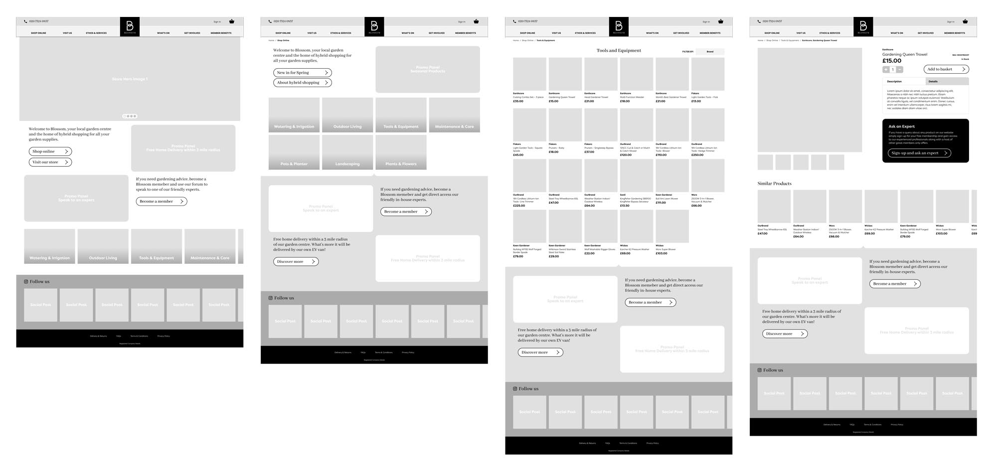
Lo-Fidelity Wireframes
I produced initial paper sketches to take in to a mid-fidelity prototype. These were quick to iterate and I went through a number of designs before I was happy with the basic layout.
Global Navigation and Home Page Layouts

Ask and Expert feature
Key decisions taken:
- Global navigation structure/layout
- The number of columns to present the products
- How the ask an expert feature would work
Mid-Fidelity Wireframes and Prototype
This was my first opportunity to build a relatively complex prototype in Figma so I went to town with the mid-fi prototype. I worked up a fully functioning global navigation with interactions as I wanted to test the usability of this aspect of the design in addition to the success of the overall user flow.
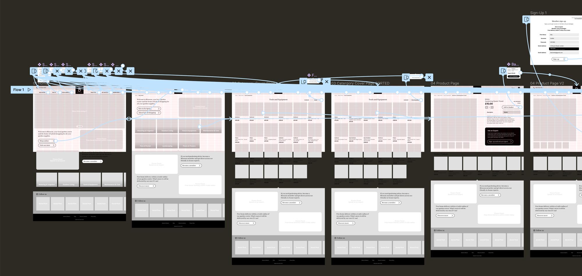
Testing
Moderated testing was carried out with three users via zoom.
The Task
- Search for the cheapest trowel on the site
- Add one to the basket
- You have a question about the trowel you want to ask the store experts so go ahead and ask the question via the facility on the product page
- After you've asked the question, check out and place your order
The Results
Tier 1 issues
- Checkout buttons could be more prominent
- Some items below the fold were not seen
- "Popular products" feature not included
Tier 2 Issue
- Review features are not included
Expected issues
- General confusion over some key aspects of the prototype functionality not being clickable
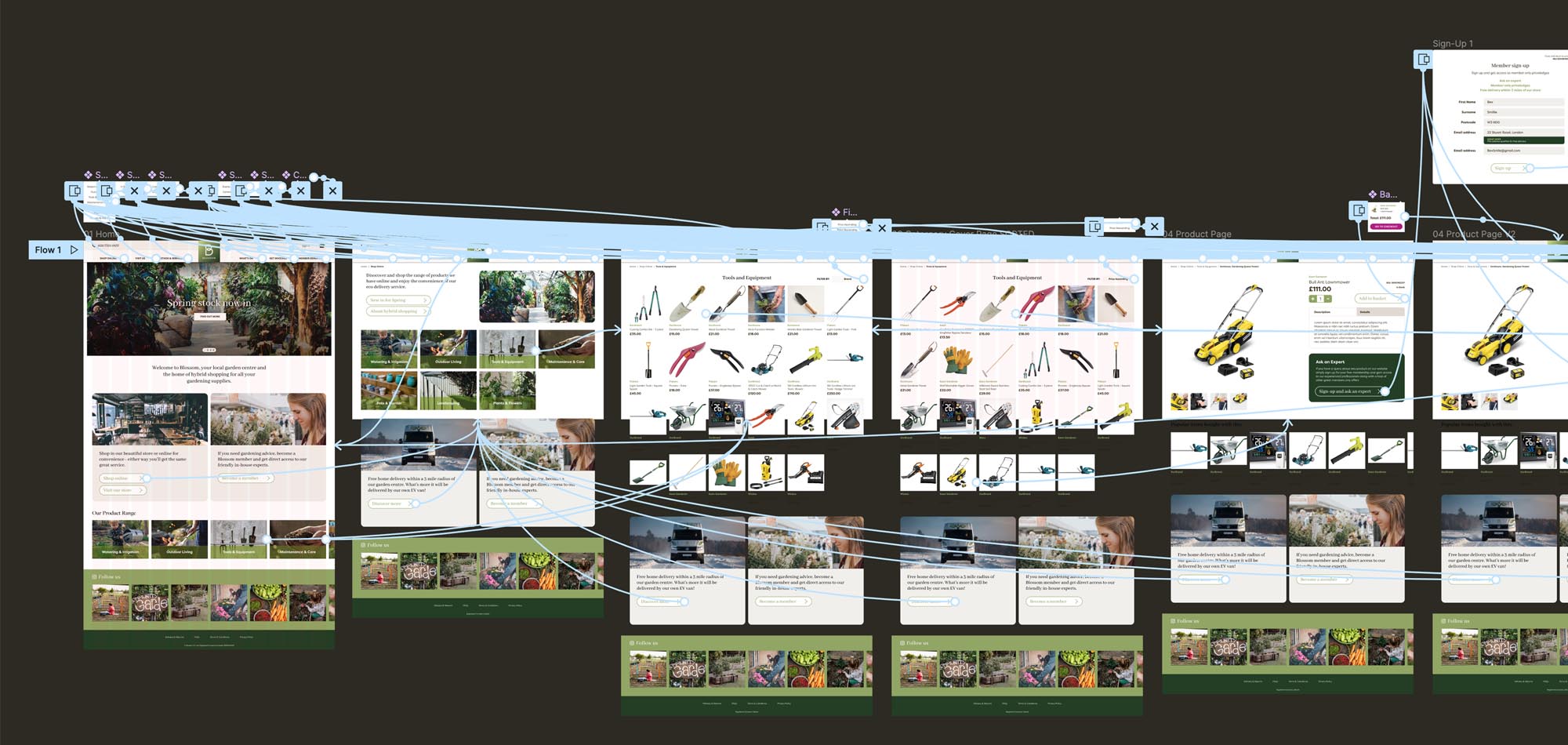
Hi-Fidelity Prototype
With constructive results from testing and issues to fix I set about pushing the design on to next phase. With 24hrs to turn this work around I focused on fixing the Tier 1 issues.

Next Steps and Reflection
Next Steps
If I was to continue working on the project I would:
- Address the Tier 2 issue from testing and test the hi-fi prototype
- Work with the client on how the practical management of the “Ask and Expert” feature would work
- Following on from this there is also a more detailed piece of work to carry out in specifying the account administration aspect of the site and payment processes
Reflection
This was my second full run through of the EDIPT process - The project was great fun and I loved every aspect of it. I particularly enjoyed the research phase and learning how assumptions can be constructed from early research data and fed in to the more in-depth user interviews. These assumptions can then be challenged and validated or disproved.
I also really enjoyed the fast pace of working through iterations to discount poor designs then moving on quickly with better solutions.
Getting to grips with Figma was hugely rewarding. I love the speed at which you can work in the software and the simplicity of how basic actions/interactions can be applied. It took me back to the early days of action script in Flash.