Nuggets
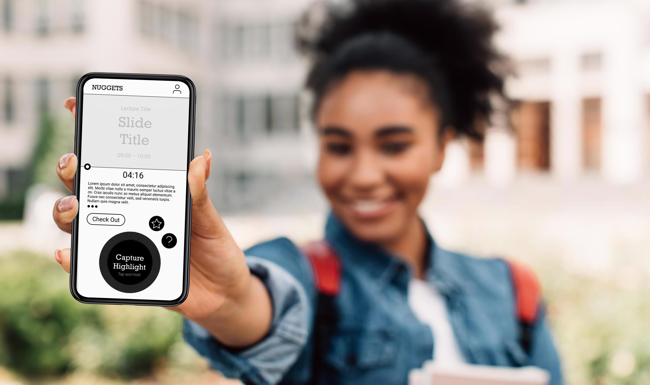
Product Conception: A new learning aid to help capture, share and like key-notes during lectures
Client: Conceptual Project
Project: Solo conceptual project at General Assembly
Date: February / March 2022
Duration: 1 week sprint
Role: Identification of Opportunity Area, User Interviews, Data Synthesis, Ideation, Prototyping
Methodologies Used: User Interviews, Affinity Mapping, Personas and Scenarios, Problem Statements, HMWs, User Flows, Ideation, Wireframing, Prototyping, Moderated User Testing
Tools: Zoom, Excel, Paper Sketches, Figma,
Team: Tom Rapacioli
The Challenge
This was my first project proper at General Assembly and the brief was as open as it could be. We were tasked with identifying a real world problem and creating a viable solution by applying the Double Diamond process over the course of a five day sprint.
Identifying the Problem
The cohort was put in to randomly selected pairs and given one hour to each share a real world problem they had recently experienced. I was paired with Daniel, who’s problem was:
"I struggle taking notes during lectures"
On the surface it was a simple statement but I could see it was a nebulous problem. A nice problem to have however for two great reasons:
- It presented an opportunity to carry out in-depth user research to better understand what lay beneath the surface of a very broad statement
- On a strategic level, I knew I would have easy access to lots of interviewees. My classmates and I were spending our days in lectures after all.
Read on to find out more…
Empathise
The first step was to empathise with potential users by listening to the experiences students typically have in and around lectures. This would help me form a better understanding of what their needs, wants and frustration are.
Round 1: Initial Interview
I arranged a follow up interview with Daniel. The aim of this initial interview was gather more insights in to what was behind his broad problem statement. This would help inform discussion guides for a second round of interviews with a wider group.
The interview with Daniel was carried out via zoom. It was deliberately kept loose as this was very much an early exploration.
Key Insight
"I feel overwhelmed with everything being thrown at me and I wish I was more organised"
Daniel was struggling to organise his notes on paper and material provided in various digital formats whilst getting to grips with new software and storage platforms. This meant he was distracted during lectures and felt he wasn’t making the most of the experience.
Affinity Map 1
From notes and recordings I created an affinity map which helped me identify themes in his frustrations. This was then translated into a topic map and further developed into a discussion guide for the next stage of interviews.

As highlighted above the initial problem was born of the online learning environment. Daniel had however recently taken part in on-campus learning which was a very different experience.
I decided that to get a holistic understanding of the problem across both settings I would explore the needs of on-campus students further. For interview I would therefore have to recruit at least one more user who had recent relevant experiences.
Interview Goals
- Discover how students feel about their overall learning experiences
- Identify what type of learning style most suits them
- Identify specific pain points or blockers with the overall learning experience
- Get context on how we might improve the learning experience
- Understand what their priorities are
- Discover if there are opportunities for improving course outcomes
- Clarify specific scenarios to give personas context
Round 2: User Interviews
The second round of interviews was conducted with a further three subjects including two with recent on-campus learning experience.
Affinity Map 2

I created an affinity map to identify trends in what users were saying and it threw out the following insights:
Key Insights
"Sometimes my notes don’t make any sense even immediately after the lecture!"
"Sometimes a lecturer will say something off-script. Capturing it in their words can be so much more useful than notes."
"If it's long I forget which bits in the lecture seemed important at the time"
"I wish I could make notes straight onto the slide deck so I can pin down the places to look"
"I wasted hours re-watching long lecture videos again!"
Define
Our Primary Persona
Now I had a better understanding of the students frustrations and needs I was ready to define a user and begin crystallising the problem down to something succinct for me to focus in on.
Introducing Freddie
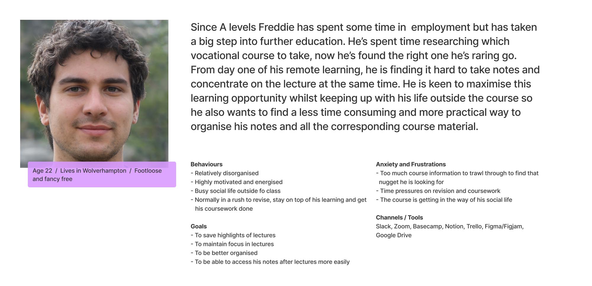
Freddie’s Problem Statement
Freddie wants a simple way to capture highlights and takeaways from lectures as he finds writing notes pointless because they are disconnected from his other course material. As a result, they have little learning value when there is no context to them and are rendered pointless.
Posing the question "How Might We?"
Below are a sample of the HMWs I generated...
How might we make note taking in lectures more streamlined?
How might we better connect note taking to the rest of the course material provided?
These questions were relatively open to avoid the trap of trying to solve the problem with the first idea.
Mapping Freddie’s Retrospective User Journey
To help visualise Freddie’s frustrations and map opportunity areas for the new product I also put together a user journey based on his recent experiences in the lecture environment.
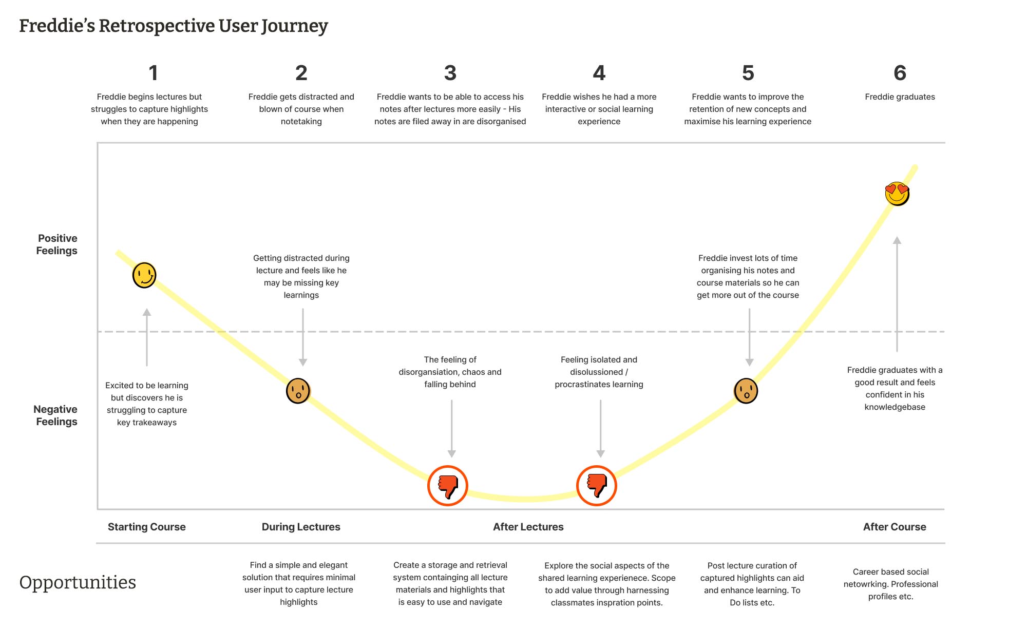
In all honesty I was having doubts about the direction of the project at this stage. I was beginning to think that Freddie’s problem was too broad and amorphous to create any meaningful solutions within the short time frame I had. It being my first Double Diamond meant I had little experience to draw on in terms of how things would pan out…
But hang on in there. Let’s see what happened next…
Ideate
Eureka! Crazy Eights, Sketching and Iteration
Before the next stage we were introduced to “Crazy Eights”. I’ve always loved sketching and generating ideas on paper but this approach took things up a notch in terms of pace. I was still having doubts but was open to being proved wrong...
Crazy Eights

I set myself a time limit of 30 seconds per square and was happily surprised by the output. Four fundamental ideas, as shown above, made it through to the final product design.
- Having a time-based aspect to the design which allowed Freddie to check-in and check-out of lectures
- A touch screen interface allowing Freddie to use simple gestures to capture key moments in a lecture such as video, images and audio recordings.
- A social aspect to the design allowing Freddie to like and share key moments in a lecture with other students
- A scrap book or repository where Freddie’s captured notes or “nuggets” could be stored, revisited and and retrieved
With renewed confidence in the direction of the project I produced several rounds of sketched wireframes that formed the outline of a viable product.
Initial Sketches
 Lo-fi Wireframes
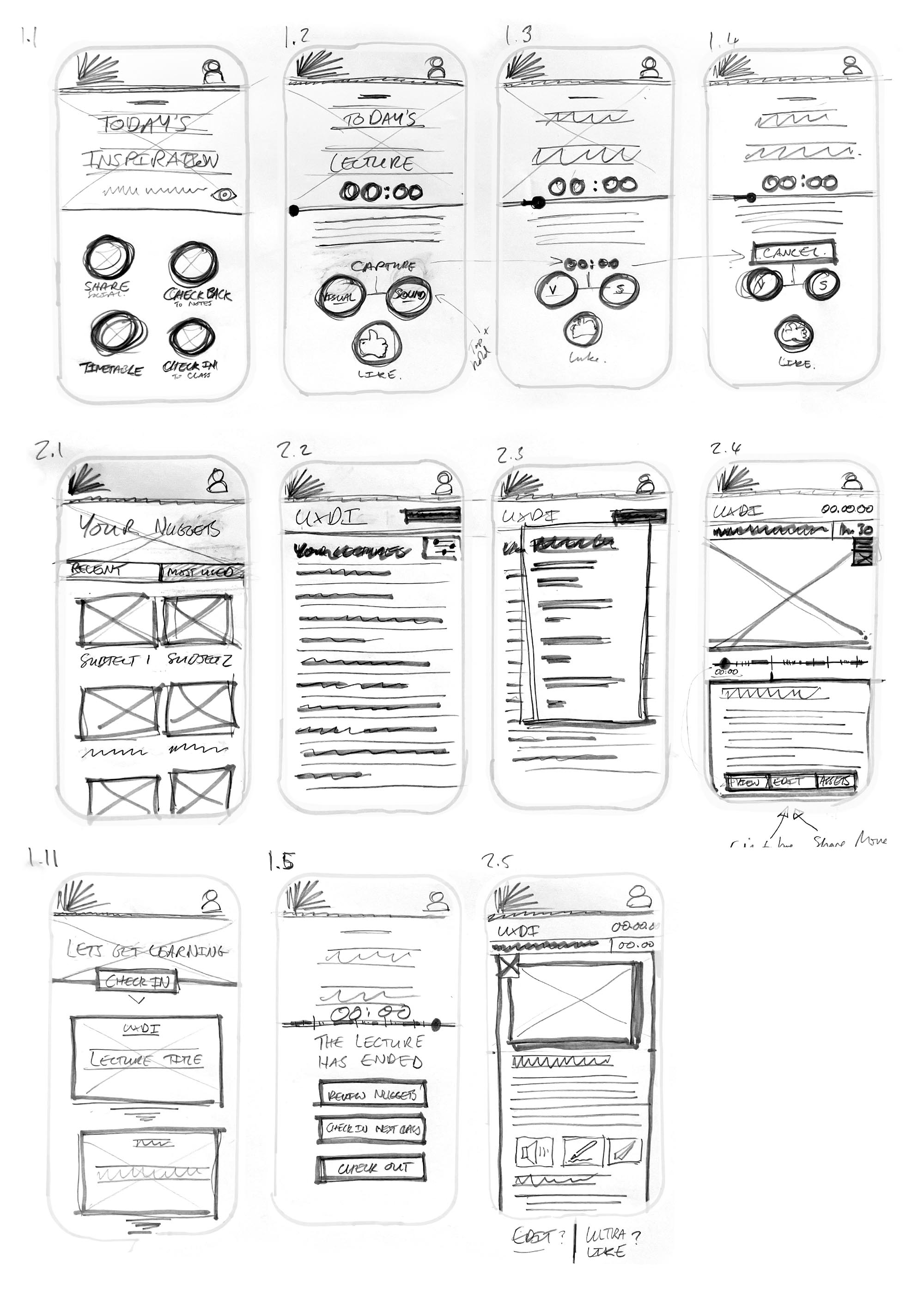
Detail added during iteration of the design included:
- A timeline based interface for during lectures allowing Freddie to capture key moments
- An inspiration piece on the home page
- A notional account section
–
User Flow
With a basic wireframe in place I now set about creating a user flow, a click through of Freddie’s happy path, ensuring all the necessary steps were accounted for along the way. This would become my road map for building the first prototype.
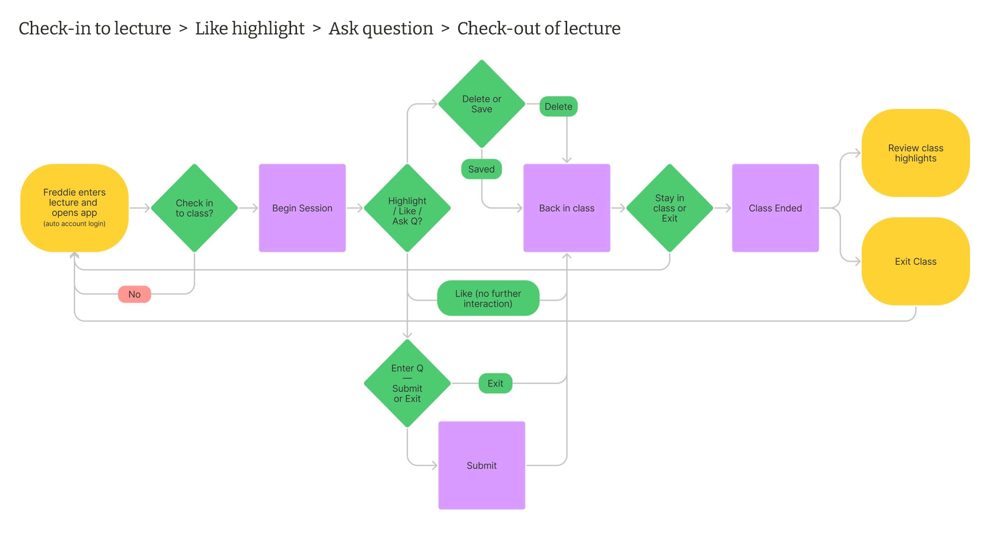
It became clear the product was taking shape as a native mobile app. It would need to utilise both technologies built-in to the operating system and the devices processing power to ensure it would respond in real time. This realisation was a key moment in the project and the vision for the overall product and business model started to become clear…
The Vision
From my user interviews it was evidenced that all lectures nowadays - whether online or on-campus - are filmed. This means that AV data could be streamed, synched, captured and shared across a network on a common platform.
The Business Case
Might educational institutions be interested in a novel way to make lectures more engaging, streamline the sharing of materials and enhance the learning experience of their students?
Prototype and Test
Creating the user flow made it clear that more detail and additional features were needed to make sure Freddie made it through his happy path. These included:
- A timetable screen to view upcoming and past lectures
- Additional buttons to help clarify the different types of interaction available
- Further consideration of interface ergonomics as a hand held device
- Confirmation screens to notify Freddie about actions he had taken
- More detail on the timeline including an adjustable capture envelope
Mid-Fidelity Wireframe and Prototype
The new features were now included in a mi-fidelity wireframe and taken through to a Figma prototype for testing.

Usability Testing and Results
Moderated usability testing was carried out via Zoom with three users. I recruited and scheduled the sessions for the following morning and in the meantime put together a well considered script and testing plan to ensure it ran smoothly. The plan included an introduction to the product, assumptions (e.g the user will have an account and be logged in) and clear but simple instructions about the task they were to perform:
The Task
- Check-in to a lecture
- Capture a highlight
- Like something
- Ask a Question
- Check out of the lecture
Results
The results were in some instances predictable but in others surprising:
Tier 1 issues
- Icons and what they represent are unclear
- Taxonomy "Check out" confusing. "Is it a shopping cart?"
- Hierarchy of buttons e.g "Check Out" is too big
- Text not needed in the lecture intro
- Groupings and position of some buttons needs some getting used to
Tier 2 issues
- The final screen was not what was expected, hence confusing
- Lots of ideas for additional features including raised hand, favourite this lecture etc. suggested by users
Next Steps, Insights and Reflection
Next Steps
If I was to continue working on the project I would:
- Address Tier 1 issues from testing in mid-fidelity wireframes and re-test prototype
- Explore ideas for additional in-lecture features with usability test candidates
- Deep dive into additional pages and post lecture content management
- Carry out competitor research
Key Insights
- Ergonomics and context will be a key factor in how the product is used and would inform how testing is conducted
- There is a potential business opportunity to explore within the higher education sector
Reflection
This was my first full run through of the EDIPT process and as an overall experience the key takeaway is the reliability of the Double Diamond. My moments of doubt were answered emphatically by the process which kept the project on track.
Trust the Double D!
